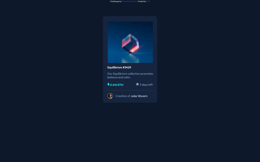
Design comparison
Solution retrospective
What did you find difficult while building the project? - As a Beginner, I'm struggling of coming up with my own code and logic, without relaying too much on Internet and tutorial. Which areas of your code are you unsure of? - I don't know about much on my code that I made, it might be bloated or not coding practice because I'm unsure of some might code are not properly good.
Community feedback
- @PhoenixDev22Posted about 2 years ago
Hello CO,
Congratulation on finishing this challenge. Great job on this one! I have few suggestions regarding your solution:
HTML
- You can use
<main>landmark for the NFT card and<footer>for the attribution as using landmarks is important to improve navigation experience on your site for users of assistive technology
- To tackle the accessibility issues in this challenge , as it’s not a whole page, you can use
<h1>instead of<h4>
- The most important part in this challenge is the interactive element. Since there's a :hover state on the image and means it's interactive, So there should be an interactive element around it. When you create a component that could be interacted with a user , always remember to include interactive elements like(button, textarea,input, ...) For this imagine what would happen when you click on the image, there are two possible ways:
1: If clicking the image would show a popup where the user can see the full NFT, here you use
<button>.2:If clicking the image would navigate the user to another page to see the NFT, here use
<a>.- You should have used
<a>to wrapEquilibrium #3429 and Jules Wyverntoo.
- For any decorative images, each img tag should have empty
alt=""and addaria-hidden="true"attributes to make all web assistive technologies such as screen reader ignore those images in (icon-view, icon-ethereum, icon-clock).
- The link wrapping the equilibrium image (
image-equilibrium) should either haveSr-onlytext, anaria-labelthat indicates where the link navigate the user(not describes the image).
- Profile images like that avatar are valuable content. The alternate text of the avatar’s image should not be empty. You can use the creator's name
Jules Wyvern. Read more how to write an alt text
- You can use unordered list
<ul>to wrapclass="description". In each<li>should be<img>and<p>.
- If you wish to draw a horizontal line, you should do so using appropriate CSS. You may remove the
<hr>, you can useborder-top:to the avatar's part.
Hopefully this feedback helps.
Marked as helpful0 - You can use
- @melco10Posted about 2 years ago
Thank you for your wonderful suggestion!!. I'm gonna try to improve this a little, using your suggestion that you make. I'm gonna keep in this mind to move on some next challenges. Have a great day!.
0
Please log in to post a comment
Log in with GitHubJoin our Discord community
Join thousands of Frontend Mentor community members taking the challenges, sharing resources, helping each other, and chatting about all things front-end!
Join our Discord
