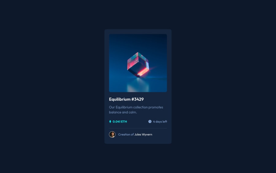
NFT Preview Card Component - HTML, CSS, Flexbox, Pseudo Classes
Design comparison
Solution retrospective
Hello All,
Please check out my completed NFT Preview Card Component. Any feedback is welcome 🤗
Community feedback
- @PhoenixDev22Posted almost 3 years ago
Hello @maquinde,
I have some suggestions regarding your solution:
-
Anything with a hover style in design means it's interactive. you need to add an interactive element
<a>
around the imageEquilibrium #3429 and Jules Wyvern
. -
The avatar 's alt shouldn't be
Image of creator
, it's meaningless , you can setJules Wyvern
to it. -
the link should be wrapping the main image and either have
Sr-only
text, anaria-label
oralt
text that says where that link takes you. -
You can use an unordered list
<ul>
to wrap `class="price-container"<li>
, there would be<img >
and<p>
. -
It's good practice to use a css reset at the start of css every time. That would do things like change images to display block instead of inline block.
-
width: 350px;
an explicit width is not a good way . Remove the width from the main component and change it tomax width
instead. That will let it shrink a little when it needs to. -
height: 596px;
Also you would never want to set theheight
of the element. Let the content inside the card element dictate the height of it. -
You should use
em
andrem
units .Bothem
andrem
are flexible, Usingpx
won't allow the user to control the font size based on their needs. -
Never use
px
for font size. -
General point , try to put classes directly on anything you want to style.
Overall, your solution is good, Hopefully this feedback helps.
Marked as helpful1 -
- @denieldenPosted almost 3 years ago
Hi Mike, I took some time to look at your solution and you did a great job!
Also I have some tips for improving your code:
- try to add a little
transition
on the element with hover effect - instead of using
px
try to use relative units of measurement -> read here
Overall you did well :)
Hope this help and happy coding!
Marked as helpful1 - try to add a little
- @maquindePosted almost 3 years ago
Hello All,
I am re-working my solution so it might look funny. I'll repost when it's complete.
0@maquindePosted almost 3 years ago@maquinde - I fixed most of the spacing and transitions and followed most of the feedback. I will keep all feedback in mind on my next project.
Thank you all!
0
Please log in to post a comment
Log in with GitHubJoin our Discord community
Join thousands of Frontend Mentor community members taking the challenges, sharing resources, helping each other, and chatting about all things front-end!
Join our Discord