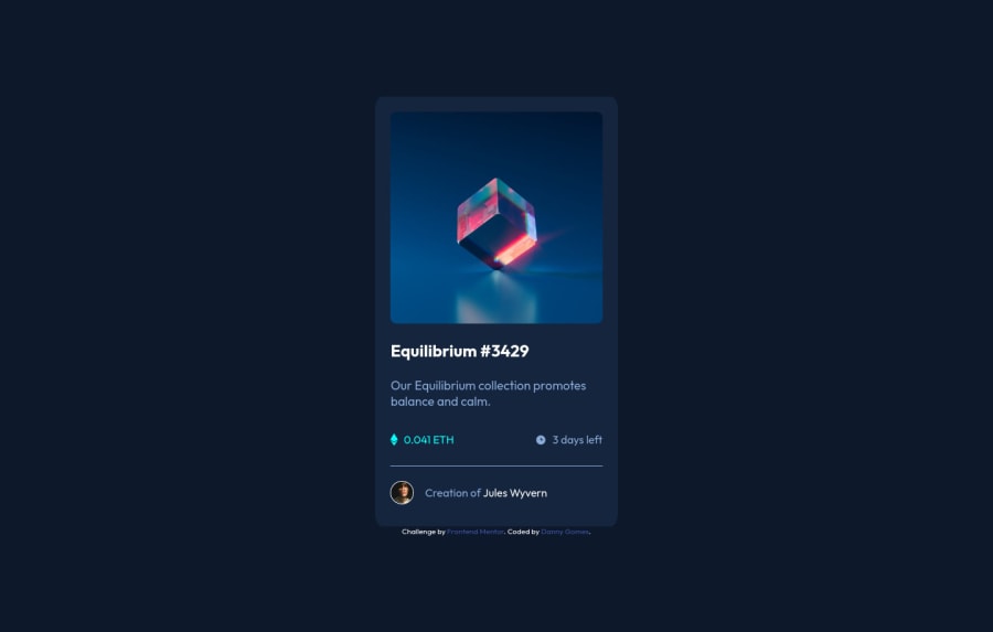
Design comparison
Community feedback
- @PhoenixDev22Posted almost 3 years ago
Hello @dannygomes,
I have some suggestions regarding your solution:
-
Use
<a>to wrap the main image loke this :<a class="img-hover" href="#"><img src="./images/image-equilibrium.jpg" alt="NFT"></a>. -
Images must have alt text.
-
For any decorative images, each img tag should have empty
alt=""andaria-hidden="true"attributes to make all web assistive technologies such as screen reader ignore those images in(icon-view, icon-ethereum, icon-clock). -
The avatar 's alt should not be
Creator, it's meaningless. you can setJules Wyvernto it. -
the link should be wrapping the main image and either have
Sr-onlytext, anaria-labeloralttext that says where that link takes you. -
You can use an unordered list
<ul>to wrapclass="center"and in each<li>, there would be<img >and<p>. -
width: 22rem;an explicit width is not a good way . Remove the width from the main component and change it tomax widthinstead. That will let it shrink a little when it needs to. -
I recommend not to style on ID'S . The best way to do that is single class selectors
You might have a look at my solution , it might my helps.
Overall, your solution is good, Hopefully this feedback helps.
Marked as helpful1 -
- @EmmanuelHexerPosted almost 3 years ago
Hi Danny, great job on completing this challenge.
However I have some tips for improving your code:
-
Links must have discernible text. To fix this add an
aria-label: img-hoverto your link. -
Also always add an alt attribute to your img elements to allow screen readers to know the thing on the website.
Marked as helpful0 -
Please log in to post a comment
Log in with GitHubJoin our Discord community
Join thousands of Frontend Mentor community members taking the challenges, sharing resources, helping each other, and chatting about all things front-end!
Join our Discord
