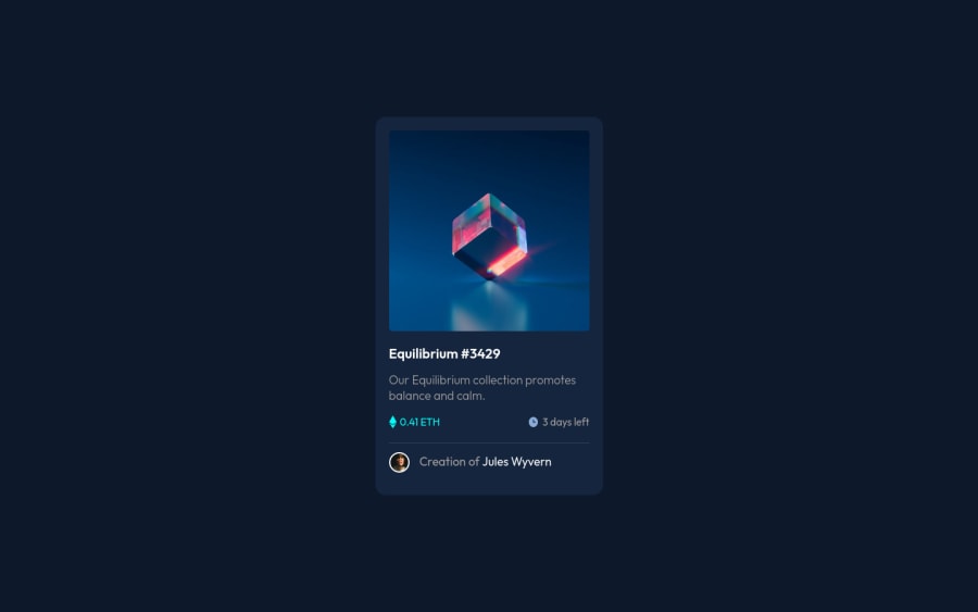
NFT preview card component - HTML and CSS
Design comparison
Solution retrospective
Hello! tried this one for today. I thought it would be an easy task but it turned out to be quite challenging. The active states were so hard for me but I was still able to finish them and I'm very proud of it. Anyway, I would appreciate any feedback to make this one as better as possible. Thank you! <3
Community feedback
- @nurularifin83Posted about 2 years ago
The solution for the warning Page should contain a level-one heading
<html lang="en">:- Put this code
<h1 class="visually-hidden">NFT preview card component examples</h1>below<main>, if you use bootstrap just put this class class="visually-hidden" for hidden text. If you did not use bootstrap then just make like this<h1 style="display: none">NFT preview card component examples</h1>. Hope it can help you.
Marked as helpful1@Galope-JheanPosted about 2 years ago@nurularifin83 Thanks! I already solved it using a different solution but I could try this one next time <33
0 - Put this code
- @wendyhamelPosted about 2 years ago
Hi, nice job on this challenge!
Only thing missing that I could find was the active state of the title.
I like your approach on the hover active state of the overlay. Clean and simple.
Happy coding!
1@Galope-JheanPosted about 2 years ago@wendyhamel Hi! I appreciate the kind words, that means a lot to me <3 also, I went on and fixed the active state of the title, there was an error earlier saying that I need an h1 so I changed my h2 to h1 and I forgot about the hover lol, thanks for pointing it out <3
0
Please log in to post a comment
Log in with GitHubJoin our Discord community
Join thousands of Frontend Mentor community members taking the challenges, sharing resources, helping each other, and chatting about all things front-end!
Join our Discord
