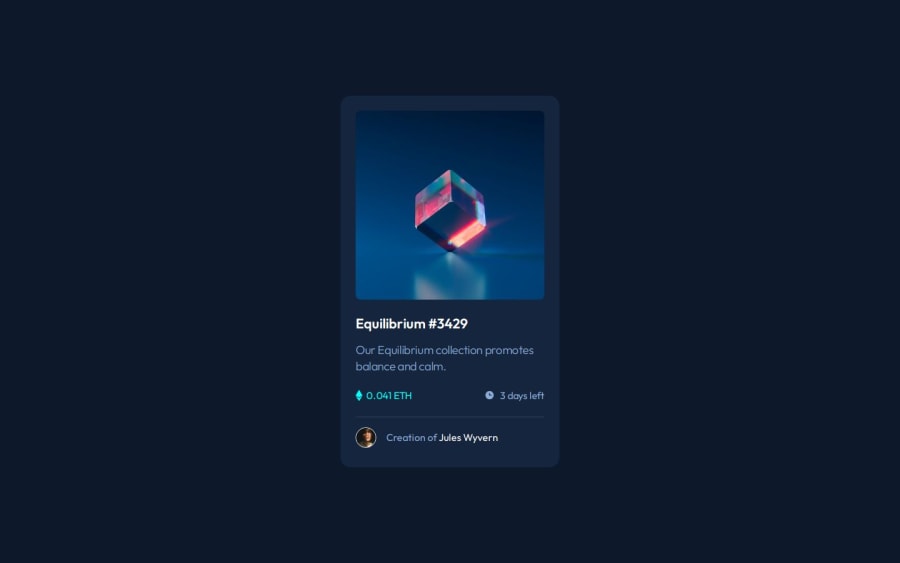
Design comparison
Solution retrospective
I am proud to be making steady progress in my knowledge of HTML and CSS. I'm not thinking of anything different to do right now. The more experience I gain, the changes will come to improve the project.
What challenges did you encounter, and how did you overcome them?One challenge was ensuring the pseudo-element covered the image correctly. I overcame this by testing and adjusting the positioning and z-index properties. Also overcome the background-color cyan with hsla, I tried using the property opacity: 0.5; but the svg logo would also get opaque. This was the old code I had previously thinking (before the hover comes):
.card__image-wrapper::after {
   background-image: url(../images/icon-view.svg);
   background-color: var(--cyan);
   opacity: 0.5;
}
Additionally, I found one issue later because I wanted to design the hover effect to be smoother.
.card__image-wrapper::after {
   opacity: 0;
   transition: opacity 0.3s ease;
}

.card__image-wrapper:hover::after {
   opacity: 1;
}
Anything. Thank you so much for your time and effort in evaluating this.
Community feedback
Please log in to post a comment
Log in with GitHubJoin our Discord community
Join thousands of Frontend Mentor community members taking the challenges, sharing resources, helping each other, and chatting about all things front-end!
Join our Discord
