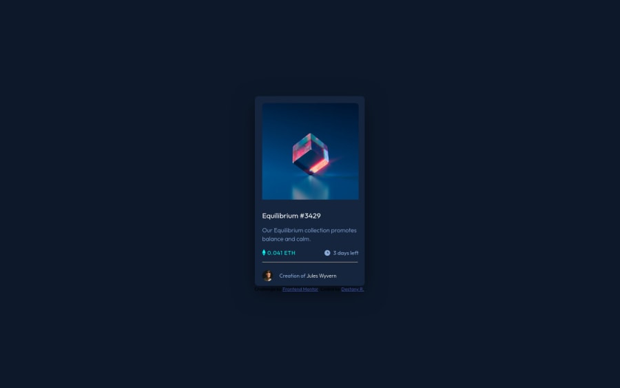
Design comparison
Solution retrospective
So I learned a lot doing this one. But I really struggled with trying to get the image to transition to the view and overlay color. I did not succeed in that portion and any advice would be nice.
I finally feel like I understood how to properly position it in the center of the page, which is great because I didn't have to use extra margin to get it positioned correctly, so that's a positive.
I need to work more on planning out my divs better, I realize that each time I do these, and thought I had it under control this time, but still found points where I confused myself.
All the designs I make seem to end up smaller than the original design and I'm not sure how to fix that or plan for it. Advice on that would be helpful as well.
Community feedback
Please log in to post a comment
Log in with GitHubJoin our Discord community
Join thousands of Frontend Mentor community members taking the challenges, sharing resources, helping each other, and chatting about all things front-end!
Join our Discord
