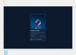
Design comparison
SolutionDesign
Solution retrospective
Your feedbacks improves my coding journey... Expecting a lot, Thanks!
Community feedback
- @pikapikamartPosted almost 3 years ago
Hey, great work on this one. Layout in general looks great, it's just a little bit bigger and the
font-sizecould be toned up as well so that it matches the size from the design.Some other suggestions would be:
- Avoid using
height: 100vhon a large container like thebodyas this makes the element's height capped based on the viewport/screen's height. Instead usemin-height: 100vhso that the element will expand if it needs to. - Use
footeron the.attributionso that it will be its own landmark. - For this one, you can change both
sectionandarticleto just usingdivsince this is just a regular content.sectionwould be better if it was a grouped content with a heading tag that describes it and anarticlewould be use when a component's content is independent from the rest of the site's content and can be share-able on the other pages of the site. - For this one, if you zoom out on your screen, the layout is now not being centered properly. Using
marginalone is not consistent when the layout needs to be centered vertically, on this one, you could remove themarginon the.cardselector and on thebodytag you could add:
align-items: center;
display: flex;
flex-direction: column;
justify-content: center;
min-height: 100vh;
Remove the
width: 85wvfrom the.containeras well.- For this, since the nft name is already present, you can use it as the nft
imgtag text likealt="Equilibrium". - On this one, since you are treating that image as an interactive component by having the
:hoverstate on it, make sure that it is using an interactive element like abuttonoratag. If by clicking the image directs are user in another page to view the full nft, then usingatag would be nice. But if by clicking the image only shows a modal/pop-up for the full nft image, thenbuttonwould be better. I haven't tackled this one so I don't have a reference about it. But maybe I could create snippet on this so that others can reference it on this one since lots of submission on this challenge haven't used any interactive element on the image part. - Remember that every page of a site needs to have an
h1, but since you are using anh2on the nft name, then theh1would be a screen-reader only heading tag. If you look at this layout, on a real site, there would be bunch of other nft right, so theh1would be a general text describing what is the main-content of the site.Have a look at this simple snippet that I have about screen-reader h1. Let me know if you have queries about this one. - The nft name is being treated as interactive as well since it has a
:hoverstate on it. It would be nice to wrap the nft name with anatag so that it uses an interactive element. - For the eth icon, since it is a real crypto currency, adding an
alt="ethereum"on it would be fine. - For the clock-icon, adding an extra
aria-hidden="true"attribute alongside thealt=""on it would be nice so that screen-reader won't pick up the image since it is hidden from it. - Person's image should be using the person's name as the
altvalue likealt="Jules Wyvern". Components like this where a person's information is presented, make sure to use their name as the person'simgaltvalue. - The person's name is interactive as well. Instead of
span, useatag on it.
Aside from those, great job again on this one.
0 - Avoid using
Please log in to post a comment
Log in with GitHubJoin our Discord community
Join thousands of Frontend Mentor community members taking the challenges, sharing resources, helping each other, and chatting about all things front-end!
Join our Discord
