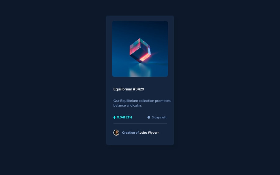
NFT preview card component using CSS flex
Design comparison
Community feedback
- @HassiaiPosted almost 2 years ago
Replace<div class="container">with the main tag and <a href="#" class="hov_heading"> with <h1> to fix the accessibility issues. in the css give h1:hover a cursor value of pointer .
There is no need to give the body a max-width value.
To center .container on the page, add min-height:100vh; display: flex; align-items: center: justify-content: center; or min-height:100vh; display: grid place-items: center to the body.
Give .container a padding value for all the sides. Give . img1 a max-width of 100% instead of a width and height values. There is no need to style .img-box
Use rem and em as unit for the padding, margins, width and font-size values. For more on CSS units click here
Hope am helpful.
Well done for completing this challenge. HAPPY CODING
Marked as helpful0@dheeraj-90040Posted almost 2 years ago@Hassiai Thank you so much I will improve my Code.
-- I don't have much idea about max - min-width: how to gain knowledge on that0@HassiaiPosted almost 2 years ago@dheeraj-90040 , https://youtu.be/YjtunZW7jxw hope this helps
Marked as helpful1
Please log in to post a comment
Log in with GitHubJoin our Discord community
Join thousands of Frontend Mentor community members taking the challenges, sharing resources, helping each other, and chatting about all things front-end!
Join our Discord
