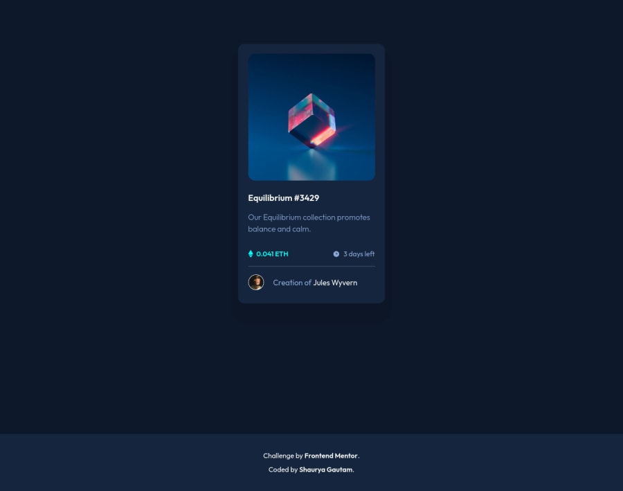
NFT preview card component challenge using Bootstrap
Design comparison
Solution retrospective
Hey Everyone! I am truly delighted to present my first ever mini project (Apart from those I have done in online courses) after learning basic Frontend!!
For the questions, here are a few which bugged me throughout the working session-
-
Should I rely on bootstrap completely for basic styling like justify-content, padding etc. instead of doing it with css?? In my project though, I tried to use bootstrap just for it's structure rather than styling.
-
Is there a way to have all hover elements (clubbing them) to have same properties as they were being repeated in my code a lot, like transitions, visibility, opacity etc.??
-
And do advice me based on my current work that how should I further improve in this field if I would have worked in a workplace with teammates, be it naming conventions, or using divs around anchors or any other that comes to your mind.
-
Also in general which units do you prefer when giving margins, padding when compared to fonts etc for better responsiveness.
-
For the media query I have set up, as the screen get's smaller it was getting worse to display the card, could you suggest something for it like which properties should I be changing
-
O ya, another one... (LAST I PROMISE) Can someone help me out with keyboard navigation. I have seen a lot of videos stating that website must be compatible with keyboard, but didn't find any one of great help
Thanks again!!
Community feedback
- @eTyradelliPosted almost 3 years ago
Hi Shaurya,
I struggled with the same questions a while ago, and then I ran into this course: https://scrimba.com/learn/spacetravel
It's a collaboration between Frontend Mentor, Scrimba and Kevin Powell, where Kevin builds a website based on a Frontend Mentor challenge. During the course you will find answers to most of the questions you are asking, as he explains the choices he makes. For example, how keyboard tabbing works and where to start with that, how and why to combine BEM with utility classes for a better structured CSS code, ideal measurement units for better responsiveness, CSS Grid and Flex box for responsive layouts and so on.
Honestly, I was blown away by the amount of invaluable info I got from this course and I can't recommend it enough.
Hope this helps you on your journey. Cheers!
Marked as helpful2@SGautam1108Posted almost 3 years ago@eTyradelli Thanks a tonne!! Will surely see the course and take my time out for it. These questions have been haunting me since the day I started CSS tbh. I hope it will help me out. Amen
1 - @Sdann26Posted almost 3 years ago
Hi Shaurya, you did an excellent job!
Only two recommendations:
Use semantic tags like
<main>
,<footer>
, etc. Although it is a component, it will help you to avoid accessibility problems.I also recommend you to use the BEM methodology to name your CSS classes. Avoid the use of ID.
Good coding :)
Marked as helpful1 - @SGautam1108Posted almost 3 years ago
Thanks alot for the suggestion @Sdann26! Great to see such an active community here ;)
1@Sdann26Posted almost 3 years ago@SGautam1108 I forgot to mention, the BEM methodology will help you to make your code more orderly and follow an order to only use classes and if your team works under this methodology it will be easier to understand where to modify the CSS. Best regards.
0@SGautam1108Posted almost 3 years ago@Sdann26 O thanks a lot for the detailed explanation, will surely look into it!
0
Please log in to post a comment
Log in with GitHubJoin our Discord community
Join thousands of Frontend Mentor community members taking the challenges, sharing resources, helping each other, and chatting about all things front-end!
Join our Discord