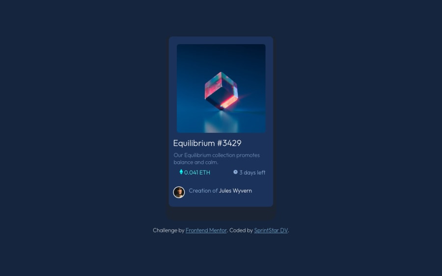
Design comparison
Solution retrospective
hello everyone!
i am currently learning & training to be a web developer & this is my first Front End Mentor challenge, so if any of you is down to review my code & share tips on what i could improve i would really appreciate it, thank you!
edit : so far my biggest issue was having a proper design for devices that aren't smartphones nor desktop (i'd love tips on that please!), i just noticed the rendering of my design gets messed up on here too but if you check my work on Github it should appear just fine.
edit #2 : i followed Pikastar's recommendations & did my best to update my code. so far the only issue i have left to tackle is making the svg appear properly on top of the image via hovering (it does show but you'll see what the issue is).
i will very probably try to come back to this soon but for now i'd love to try other challenges so i can do different, still, i'll pay attention to all the precious advice shared with me! ^^
Community feedback
- @pikapikamartPosted almost 3 years ago
Hey, great work on this one and also, congrats on your first challenge here at FEM! Hope that you found doing the challenge exciting and learned something from it. At the moment, the layout could use some adjusting on it so that it will match the design and also, if you go to at mobile view, at around 370px, the layout just squished itself. If you are going to refactor it, then that would be really nice.
Here are some suggestions for the site:
- Don't use
width: 100vw
since this will only add a horizontal scrollbar at the bottom, since this value does not account the vertical scrollbar's width. - Avoid using
height: 100vh
on a large container like thebody
as this makes the element's height capped based on the viewport/screen's height. Instead usemin-height: 100vh
so that the element will expand if it needs to. - It would be great to have this markup:
<main /> # contains the main-content <footer /> # contains the attribution
This way, all content of your page will be inside their own respective landmark element. So instead of two
div
as the direct child of youbody
tag, it will bemain
andfooter
.- To make the layout centered, on your
body
tag, you could set these stylings on it:
align-items: center; display: flex; flex-direction: column; justify-content: center; min-height: 100vh;
Normally, you will find yourself using those stylings a lot when centering contents as you go along.
- You are missing the
:hover
state for theimg
. On your solution page of this challenge, you can go to thechallenge hub
and to thesolutions
so that you could see other people's submission on this challenge. You can always take note on how they approached a specific challenge. - You can use the nft name as the nft
img
alt
value since it make sense to do so. It could be something likealt="nft Equilibrium #3429"
. Although thealt
doesn't really describe the nft itself, but hey, nft is to be seen. - For now, you could use
h1
for the nft name since a singleh1
is needed on a page. The:hover
state on it is missing as well. But on the nft name, your markup should be something like:
<h1> <a href="#">Equilibrium #3429</a> </h1>
You will need to use
a
tag because whenever you create an interactive component, interactive element must be used as well.- On this one, the eth-icon and the clock-icon serves only as decoration on the site. Decorative images are images that doesn't really contribute on the overall content of the site since they are only decoration. Decorative images should be hidden for screen-reader at all times by using
alt=""
andaria-hidden="true"
to theimg
tag or onlyaria-hidden="true"
if you are usingsvg
instead ofimg
tag. - You could use the person's name as the person's image
alt
value since it makes sense to do so since their name is already present. - The person's name should be interactive as well. So inside the
p
tag, add ana
tag to wrap the person's name. - Lastly, on your
.central1
instead of using%
for thewidth
property, userem
so that it will be consistent for user. You can use%
but only if you are properly controlling the size of an element.
Aside from those, great job again on this one and looking forwards on your other challenges here at FEM^^
Marked as helpful0@SprintStarDVPosted almost 3 years ago@martpika I'll try to come back to this challenge as soon as possible so that i can follow your suggestions to upgrade my design. Thank you so much for this detailed reply this is greatly appreciated!
1 - Don't use
- @brodiewebdtPosted almost 3 years ago
The design only needs to be about 350px. You don't need to resize it for every resolution.
Hope this helps.
Marked as helpful0
Please log in to post a comment
Log in with GitHubJoin our Discord community
Join thousands of Frontend Mentor community members taking the challenges, sharing resources, helping each other, and chatting about all things front-end!
Join our Discord