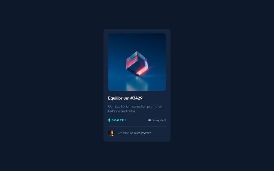
Design comparison
Solution retrospective
This is my third challenge from a frontend mentor. This challenge was really simple! Even without figma files, I tried to mimic the look of the card as much as possible.
Community feedback
- @AlexKMarshallPosted about 3 years ago
This looks good on large screens and matches the design very well.
Take care of the semantics though. You've got an anchor wrapped round the image, that probably makes more sense as a button. On a real site I'm guessing that's going to expand the image in a light box.
Similarly, you have on
:hover
effects on your heading. That implies clicking it will do something. Presumably take you to a new page. So that needs to be wrapped in an<a>
. Same with the 'Jules Wyvern' text.The svg icons are just decorative images and provide no additional meaning, so give them
alt=""
andaria-hidden
.For the styling, make sure that things are responsive. At the moment you get horizontal overflow when the screen is smaller than about 360px, and this is because you have set explicit widths on your containers. Avoid doing that as it will make them much less flexible. You can use
max-width
instead, which will allow them to shrink smaller when there isn't space available.Same thing for fixed heights. You have one on your container div. If someone was to put more content in here, for instance a longer paragraph text, your layout would break. Always plan for more or less content than is in the static design.
Marked as helpful1@ttoomasPosted about 3 years ago@AlexKMarshall Hello, thanks a for the advice. I tried to put everything you wrote into my code. I made the card responsive on smaller devices and removed the width of the image and the container. Would you please look at my new solution to see if it's okay? Thank you very much.
0 - @IEdiongPosted about 3 years ago
Hello, your text seem to be center aligned on smaller screen sizes. You could try fixing that. Generally, I think you implemented the earlier advice well.
Marked as helpful0@ttoomasPosted about 3 years ago@IEdiong Hi, thanks for the comment. The text has really been centered, it's already fixed. On smaller devices, I changed the font size a bit smaller.
0 - @ttoomasPosted about 3 years ago
In the last edit, I noticed that when I hover over the text " Jules Wyvern "is not just to change the color of the text, but to add a border around the image. Using a simple Js, I added an" active "class as I hover over the text, which simply adds a border around the image. I was just wondering, could it be done without js, using
:hover
?0@inesriahiPosted about 3 years ago@ttoomas I did this by reversing the order of the footer (if you are putting it in a flexbox) and then set
flex-direction: row-reverse
. I then applied this selector to be activated whenp
is hovered.card > .footer p:hover + img { border: 1px solid white; border-radius: 50%; }
To disable the hovering effect when the normal text is hovered, I set
pointer-events:none
for thep
element and setpointer-events:auto
for thea
tag.This is my HTML structure for this part
<div class="footer"> <p>Creation of <a href="">Jules Wyvern</a></p> <img class="avatar" src="images/image-avatar.png" alt="Avatar" /> </div>
Maybe this is an awkward solution but at least it works without using JS. Hope this is clear.
Marked as helpful0@ttoomasPosted about 3 years ago@onshadi This is an interesting solution! This did not occur to me. It's maybe better than doing it through js. Thanks so much for your solution!
1
Please log in to post a comment
Log in with GitHubJoin our Discord community
Join thousands of Frontend Mentor community members taking the challenges, sharing resources, helping each other, and chatting about all things front-end!
Join our Discord