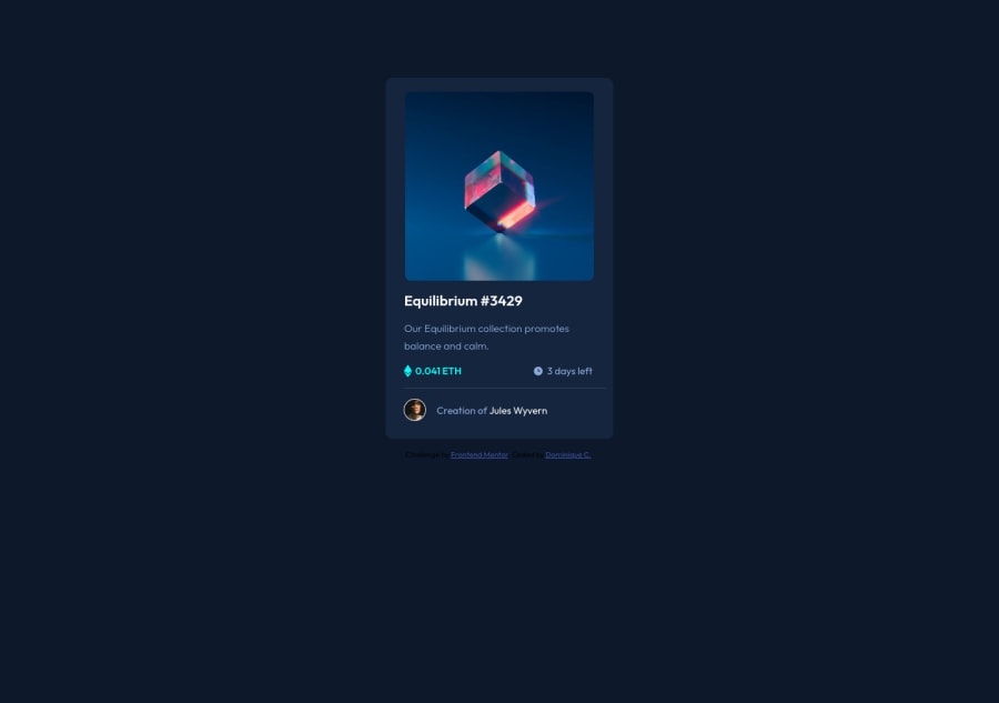
Design comparison
Solution retrospective
Hi! I would love input on anything I could've changed or improved on.
I would like insight on the font unit I used for a majority of the styles.css area (REM). I tried to utilize this unit because I've learned that it scales better. For the media query, I used mostly percents and px but I would like information as to what units are best for handling media queries.
Any other input is welcomed as well!
Thank you!
Community feedback
- @lukakavtarraPosted almost 3 years ago
Hey @Domeniquemc , I looked your code and I had same accessibility issues. If you wrap your body content with main tag & footer tag it should solve that issues :))
Marked as helpful1@dominiquemcPosted almost 3 years ago@lukakavtarra Hello! I fixed it on my end but do you mind verifying if it was done correctly?
Update: I generated a new report. It looks like the accessibility issues are no longer there after fixing the issue (aside from the L1 heading). Thanks for your help :)
0@lukakavtarraPosted almost 3 years ago@dominiquemc you should have at least 1 heading and that's it :) (use <h1> tag somewhere)
also can u contact me on the IG? I'll try to help u with some other stuff that i noticed in ur html/css IG:Lukakavtarra
1
Please log in to post a comment
Log in with GitHubJoin our Discord community
Join thousands of Frontend Mentor community members taking the challenges, sharing resources, helping each other, and chatting about all things front-end!
Join our Discord
