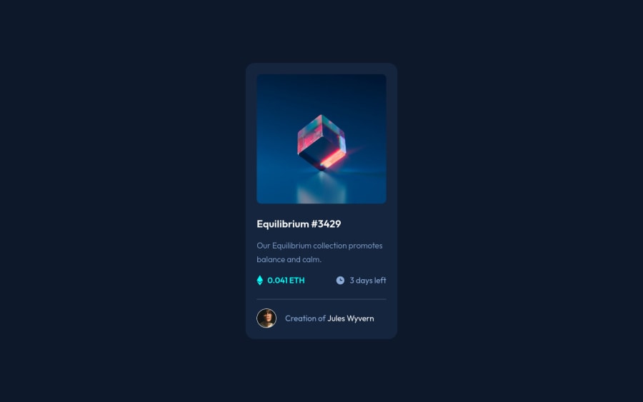
Design comparison
Community feedback
- Account deleted
Hey @explorem, some suggestions to improve you code:
-
The NFT Alt Tag description needs to be improved upon. You want to describe what the image is; they need to be readable. Assume you’re describing the image/icon to someone.
-
The Icons serve no other purpose than to be decorative; They add no value. Their Alt Tag should left blank and have an aria-hidden=“true” to hides it from assistive technology.
-
Wrap the "NFT image", "Equilibrium #3429" and "Jules Wyvern" in an Anchor Tags <a>. The anchor tag will allow users to click on content and have them directed to another part of your site.
Happy Coding! 👻🎃
Marked as helpful1 -
- @im-abhijitPosted over 2 years ago
hi @explorem, congratulations on completing this challenge and you did a fantastic job
at the end of the card in the creator name "Creation of Jules Wyvern". there should be hover effect on "Jules Wyvern" also , the color of this text should change to cyan on hovering
rest all looks good
Marked as helpful1@exploremPosted over 2 years agoHi @im-abhijit, tkank you for your feedback :)
I have to check on other browsers. Everything works for me.
0 - @gauravsingh1281Posted over 2 years ago
Hii Dominika, Congratulations on completing this challlenge 👏👏. I have a suggestions for you. You only use hovering effect after width : 1440px you should apply this to all the orientation so that hovering effect work on all the devices.
Marked as helpful1@exploremPosted over 2 years agoHi @gauravsingh1281, tkank you for your feedback. I think hovering effect work olnly on desktop view. I forgot that the screens can be smaller than 1440px.. I will definietly change it :)
1
Please log in to post a comment
Log in with GitHubJoin our Discord community
Join thousands of Frontend Mentor community members taking the challenges, sharing resources, helping each other, and chatting about all things front-end!
Join our Discord
