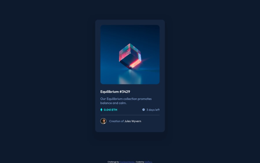
Design comparison
Solution retrospective
- What did you find difficult while building the project?
Answer: Replicating the mobile device design to the project.
- Which areas of your code are you unsure of?
Answer: I'm unsure of the mobile device design that I created in the project.
- Do you have any questions about best practices?
Answer: Best practice in styling website.
Community feedback
- @Sdann26Posted over 2 years ago
Apart from the recommendations given above you could add
transition: all 500ms;
to all elements that have hover, focus, active, etc.This will give it a more professional touch.
By the way I would not recommend to give classes taking into account the id, since they are unique and therefore the idea is to reuse the classes as much as possible so that your code is not too big.
Well that's all, I hope it helps you to improve my comments.
Good luck!
Marked as helpful0@wafferuPosted over 2 years ago@Sdann26 I see. Thank you for your recommendation. I will try your tips on my future projects.
1 - @SYadanarPosted over 2 years ago
Hello Mark, Congratulations! 🥳 You did a great job.
I would like to suggest you to use
@media
queries in your CSS to apply different styles for different devices. CSS @media Rule - By W3SchoolHope this may help you with creating mobile views faster ✌️
Marked as helpful0@wafferuPosted over 2 years ago@SYadanar Thank you. I will try this one in my next project.
0
Please log in to post a comment
Log in with GitHubJoin our Discord community
Join thousands of Frontend Mentor community members taking the challenges, sharing resources, helping each other, and chatting about all things front-end!
Join our Discord