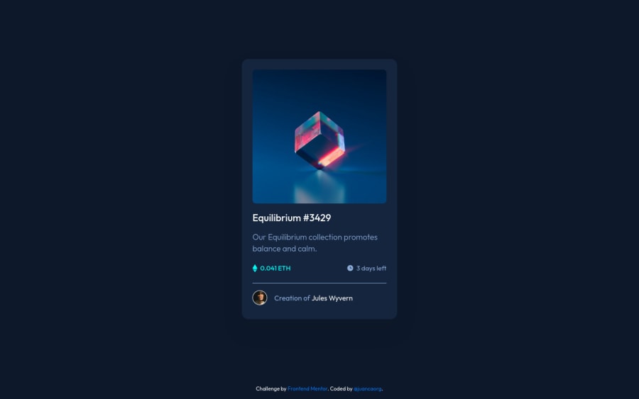
Design comparison
Solution retrospective
I struggled on how to overlap elements in CSS. The "obvious choice" would have been to use position: absolute
.
But found out a better way using CSS Grid. You can set all the grid items to be in the same cell :)
Community feedback
- @PhoenixDev22Posted about 2 years ago
Hi Juan,
Congratulation on finishing this challenge. Excellent work! I have few suggestions regarding your solution:
HTML
- The most important part in this challenge interactive elements. Since there's a :hover state on the image and means it's interactive, So there should be an interactive element around it. When you create a component that could be interacted with a user , always remember to include interactive elements like(button, textarea,input, ..)
for this imagine what would happen when you click on the image, there are two possible ways:
1: If clicking the image would show a popup where the user can see the full NFT, here you use<button>
. 2:If clicking the image would navigate the user to another page to see the NFT, here you can use<a>
.
For the same reason, you can use
<a>
to wrapEquilibrium #3429 and Jules Wyvern
.- The link wrapping the equilibrium image should either have
Sr-only
text, anaria-label
oralt
text that says where that link takes you.
- For any decorative images, each img tag should have empty
alt=""
and addaria-hidden="true"
attributes to make all web assistive technologies such as screen reader ignore those images in( icon-view, icon-ethereum, icon-clock ).
- Never use
<div>
and<span>
alone to wrap a meaningful content. Just keep in mind that you should usually use semantic HTML in place of the div tag unless none of them (the semantic tags) really match the content to group together. By adding semantic tags to your document, you provide additional information about the document, which aids in communication.
- For middle part of the card
class="nft-preview-card__product-info-container"
, you can use an unordered list<ul>
, in each<li>
there should be<img>
and<p>
. That way you can align them centrally.
- If you wish to draw a horizontal line, you should do so using appropriate CSS. You may remove the
<div class="nft-preview-card__author-line"></div>
, you can useborder-top:
to the avatar's part.
- There are so many ways to do the hover effect on the image, The one I would use is pseudo elements
::before, ::after
. You can use pseudo-elements to change the teal background color to hsla. Then the opacity can be changed from 0 to 1 on the pseudo element on the hover. Also using pseudo elements makes your HTML more cleaner as there's no need for extra clutter in the HTML. The icon view does not really need to be in the HTML. You can use CSS for it.
- Adding
rel="noopener"
orrel="noreferrer"
totarget="_blank"
links. When you link to a page on another site usingtarget=”_blank”
attribute , you can expose your site to performance and security issues.
Hopefully this feedback helps.
Marked as helpful1@juancaorgPosted about 2 years ago@PhoenixDev22 Thanks for your extensive feedback!
Didn't think about adding
<a>
tags to the interactive elements, now it seems so obvious after reading about it 😅.Didn't know about decorative images. Really appreciate that you shared an article about that to learn more. Now that's fixed.
Also forgot about the `rel="noopener" attribute on my external links. I searched about that and you're totally correct. Now that's fixed too.
I implemented most of your suggestions to my code. Great feedback and again, thanks for your help! 🙌
0 - The most important part in this challenge interactive elements. Since there's a :hover state on the image and means it's interactive, So there should be an interactive element around it. When you create a component that could be interacted with a user , always remember to include interactive elements like(button, textarea,input, ..)
for this imagine what would happen when you click on the image, there are two possible ways:
- @elaineleungPosted about 2 years ago
Hi Juan, great job solving the challenge! This is certainly the first time I've seen someone use grid for the overlay, and I think that's a very creative way of doing it. Some people use pseudo elements and some use another container placed after the image (somewhat like what you did), but as you said, these do involve
position: absolute
. If you did try usingposition: absolute
, I'm curious as to what issues you ran into; the most common one I see is people not setting aposition: relative
on the container they want the element to be positioned with (usually the parent container).The other question I have is, I notice that instead of setting padding on the
main
container, you had it around the image and text containers individually. I'm just curious what is it that led to this decision, since for me, I always try to set the padding on the parent container.One suggestion I'll offer is, you can add some margin around the main container so that on smaller screens (yes, there could be screens smaller than 326px!), the browser sides won't be touching, and on that note, you can consider making the max width greater than 326px since it looks a bit smaller than the original design.
Anyway, great job on the whole for this challenge! 😊
Marked as helpful1@juancaorgPosted about 2 years ago@elaineleung It was probably that. Didn't know that I had to set the parent container to
position: relative
so that the child containers could work correctly.I struggle with
position: absolute
because I have to think more (imo) instead of letting everything to sort out when I use flex or grid, so decided to look for a solution using that instead, haha 😅To your other question, is because I was wrong and I complicated things. I followed your advice and it reads much simpler, thanks!
Also thanks for your last suggestion, just followed that too and fixed it.
As always, great feedback. Really appreciated! 🙌
1@elaineleungPosted about 2 years ago@juancaorg Glad to hear, and I'm happy help out as always! 🙌
1
Please log in to post a comment
Log in with GitHubJoin our Discord community
Join thousands of Frontend Mentor community members taking the challenges, sharing resources, helping each other, and chatting about all things front-end!
Join our Discord