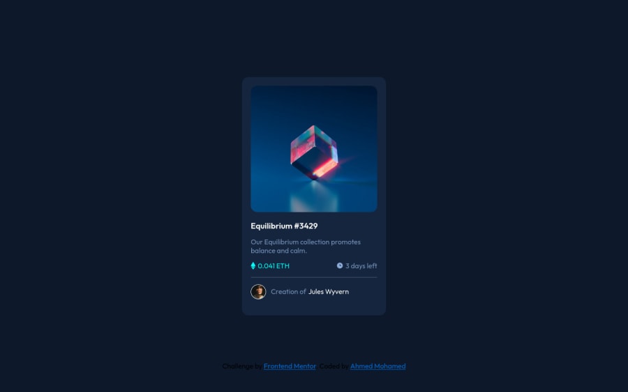
Design comparison
Community feedback
- @VCaramesPosted about 2 years ago
Hey there! 👋 Here are some suggestions to help improve your code:
-
Change
widthtomax-widthin your component’s container to make it responsive. -
The “NFT Image” is not decorative; it is the product. It should have an Alt Tag with a description; Assume you’re describing the image to someone.
-
The overlay hover effect was not applied. Here is a link that will show you how to apply it.
https://www.w3schools.com/howto/howto_css_image_overlay.asp
-
The icons need to have a blank Alt Tag along with an aria-hidden=“true”* to hides it from assistive technology.
-
Wrap the "NFT image", "Equilibrium #3429" and "Jules Wyvern" in an Anchor Tags. The anchor tag will allow users to click on content and have them directed to another part of your site.
If you have any questions or need further clarification, feel free to reach out to me.
Happy Coding! 🍂🦃
0 -
Please log in to post a comment
Log in with GitHubJoin our Discord community
Join thousands of Frontend Mentor community members taking the challenges, sharing resources, helping each other, and chatting about all things front-end!
Join our Discord
