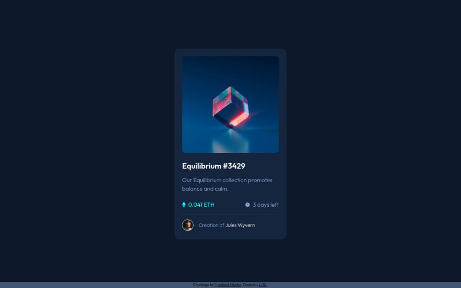
Question about the border-radius difference bt container & image


Design comparison

Solution retrospective
Hello everybody,
it is my second challenge here, and I still learned a lot from this small challenge which is awesome!
I have two things that would like to discuss with you. Please feel free to answer one or both of them.
#1
I wonder why even I set card-img-container & img.cube the same border-radius (10px), they just don't fit. The background colour of container will appear a little, so that's why I changed its border-radius to 12px in order to hide.
If you use devtool to check, you will see what I mean.
#2
To write a hundred percent alike layout is fun! Yet, about the tiny tweaks of font family, font-size, line-height... I always spend lots of time on it. I wonder what's your order to take care of these properties? How do you figure it efficiently from the beginning? I also felt this time my HTML structure wasn't good enough, so that might be another reason leading to my long codes.
Thank you, and have a great day :D
Community feedback
- @vanzasetiaPosted almost 2 years ago
Hi, LJBL!
About your questions:
- The background color of the
.card-img-containeris taking the exact width and height of it. That is why when you setborder-radiusto it, the background color will follow the border radius. You should only set theborder-radiuson the.card-img-container. Then, setoverflow: hiddento make the image follow the parent element's border radius. But, there is a better way to create the overlay. - It's okay not to have the exact number of the
font-sizeandline-heightsince you don't have access to the design file. As long as it is similar to the design then that's okay. Instead, focus on the accessibility part of the page such as good HTML markup, and avoid usingpxunits. You want to focus on your code quality.
To improve the image's overlay, you need to fix the HTML markup first.
- Remove
<img class="view">. - Remove
<div class="card-img-container">. Use the<a>as the container of the Equilibrium image. - Remove
rel="noopener" target="_blank"attributes. Only use them for external links.
Then to create the overlay, you just use CSS by using background properties and a pseudo-element. First, create a pseudo-element from the anchor tag. After that, set
background-colorandbackground-imageto create the overlay.Other suggestions:
- Having
<h1>as the child element of the<a>is potentially invalid HTML. So, make the<h1>as the parent element of the<a>instead. Reference: Caninclude - The clock and Ethereum icons are decorative images. So, leave the alternative text empty.
- For your information, decorative images are images that don't add any information and serve only aesthetic purposes.
I hope this helps. Happy coding!
Marked as helpful1@LJBL22Posted almost 2 years ago@vanzasetia
Hi Vanza, thanks a lot! I just came back from a vacation, I'll check your advice in details and see if there's anything that I don't understand. So far by taking a quick look, I already learned a lot!
1@LJBL22Posted almost 2 years ago@vanzasetia Hi Vanza, I had some struggle on the pseudo element part. I tried to add ::before with property bg-color, ::after with property bg-img (both with content: '') , but they look like a dot on the page. It seems like I cannot add width & height to them (because they are inline element according to devtool), I add hover effect and even z-index yet still failed. There must be something that I cannot figure it out. Could you provide more suggestions on it when you're available? Much appreciate it! Have a good day!
All other suggestions I've applied, and help a lot! Thanks!
0@vanzasetiaPosted almost 2 years ago@LJBL22
I looked a lot at the updated solution and don't see any pseudo-elements on the
<a>. The:hovershould be on the<a>not on the<div class="card-img-container">.You don't need that
<div>andicon-view.svgas an<img>element.For the pseudo-element, you just need one pseudo-element from the
<a>that wraps theimage-equilibrium.jpg. After, that you make the pseudo-element fill the entire image using absolute positioning.When I was creating the overlay, I made the
<a>tag a block element. Doing that would make the pseudo-element respond to thewidthandheightproperties.I didn't need
z-indexproperty when I was creating the overlay. The pseudo-element is already positioned above the image.Marked as helpful0@LJBL22Posted almost 2 years ago@vanzasetia
Thanks for your reply, please see my code again. I tried several ways:
-- Way 1 pseudo element doing nothing, eye image was under the bg-color (so it doesn't show as white as it should be)
.main-img-container {
  position: relative;
  display: block;
  background-color: var(--cyan);
  background-image: url(./images/icon-view.svg);
  background-repeat: no-repeat;
  background-position: center;
  border-radius: 10px;
  overflow: hidden;
}

/* .main-img-container::before {
  content: "";
  display: block;
  background-image: url(./images/image-equilibrium.jpg);
  position: absolute;
  top: 0;
  left: 0;
  width: 100%;
  object-fit: cover;
} */

.main-img-container:hover .cube {
  opacity: 0.5;
}

.main-img-container:hover .main-img-container::before {
  opacity: 1;
}
<a href="#" class="main-img-container"> <img class="cube" src="./images/image-equilibrium.jpg" alt="NFT cube pic" /> </a>-- Way 2 following the first, release the pseudo element comments, then comment the <img class="cube"> => all main pic gone
-- Way 3 bg-color & eye image doesn't show up, only the cube pic opacity: 0.5 happened
.main-img-container {
  position: relative;
  display: block;
}

.main-img-container::before {
  content: "";
  display: block;
  background-color: var(--cyan);
  background-image: url(./images/icon-view.svg);
  background-repeat: no-repeat;
  background-position: center;
  border-radius: 10px;
  overflow: hidden;
}

.main-img-container:hover .cube {
  opacity: 0.5;
}

.main-img-container:hover .main-img-container::before {
  opacity: 1;
}
For the way 1 & 3, I also update commit on my github, thank you!
Also, even if I change
::beforeto::after, nothing happened > <0@vanzasetiaPosted almost 2 years ago@LJBL22
You are almost there to create the overlay. I made some changes in my developer tool to make the overlay show up properly.
.main-img-container::before {
  content: "";
  display: block;

  /* Use hsla color format to control the opacity of the
      color */
  background-color: hsl(178, 100%, 50%, 0.5);

  background-image: url(./images/icon-view.svg);
  background-repeat: no-repeat;
  background-position: center;
  border-radius: 10px;
  overflow: hidden;

  /* Added code */
  position: absolute;
  top: 0;
  left: 0;
  right: 0;
  bottom: 0;
}

/* Remove the "opacity" property */
.main-img-container:hover .cube {
  /* opacity: 0.5; */
}
Setting
display: blockon the pseudo-element will not make it fill the entire space. You need to use absolute positioning to make it cover the image.Marked as helpful0@LJBL22Posted almost 2 years ago@vanzasetia Hi Vanza,
I found a new problem, looks like this line of my code doesn't work.
.main-img-container:hover .main-img-container::before { opacity: 1; }Is it because the pseudo element?Also, I tried what you suggest, yet there's no hover effect, the pic of view & cyan hsla background are just right over the cube pic. Not sure how to do now ^^"
0@vanzasetiaPosted almost 2 years ago@LJBL22
To select the pseudo-element on hover, you should do
.main-img-container:hover::before.Marked as helpful1@LJBL22Posted almost 2 years ago@vanzasetia Thank you so much Vanza! I finally figure it out! I've put you in my README acknowledgement! Happy coding!
1@vanzasetiaPosted almost 2 years ago@LJBL22
That's good to know. Congrats! 🎉
Great job on taking some time to write what you have learned in the README. 👏
Thank you for putting my name on the README. I appreciate it. 😄
1 - The background color of the
- @HassiaiPosted almost 2 years ago
To center the main on the page using flexbox, add min-height: 100vh to the body.
To center the main on the page using flexbox:
body{
min-height: 100vh;
display: flex;
align-items: center;
justify-content: center;
}
There is no need to give the main a height value. the padding value is be a responsive replacement of that.
Hope am helpful.
Well done for completing this challenge. HAPPY CODING
0@LJBL22Posted almost 2 years ago@Hassiai
Hi Hassia
Thanks for your reply! I wonder why I need to add another 100vh to body since I gave it 100% already. Also , I was thinking by giving the ‘main’ height and width I can fix the card size first, while what you suggest is by giving 100vh and the latter on CSS setting, it will naturally be the same result? If I misunderstood, please let me know. Thanks!
0@HassiaiPosted almost 2 years ago@LJBL22 the min-height: 100vh is to help center the main on the help within a minimum height of 100vh so that the main can be centered on the page if its height is above the min-height.
Givin the main a height value will make the content overflow when the screen is resize, at times using the height is not a good practice such as in responsive design. the padding-top and bottom value can replace the height.
Hope am helpful
0


Please log in to post a comment
Log in with GitHub
Join our Discord community
Join thousands of Frontend Mentor community members taking the challenges, sharing resources, helping each other, and chatting about all things front-end!
Join our Discord