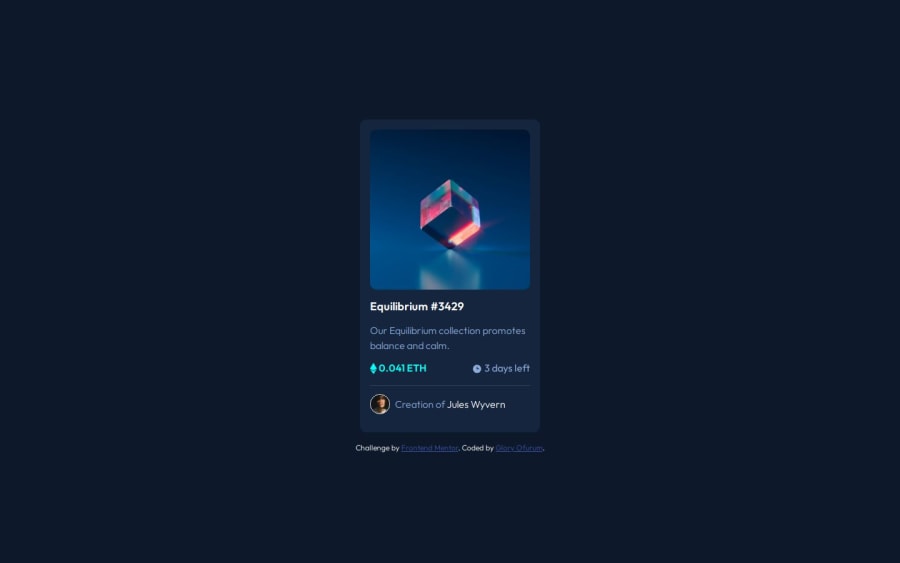
Design comparison
Solution retrospective
I am proud of being able to complete this challenge.
What challenges did you encounter, and how did you overcome them?I had challenges with the image overlay.
What specific areas of your project would you like help with?I would need feedback on how I can improve the code. Thanks.
Community feedback
- @grace-snowPosted about 1 month ago
Hi,
This appears very distorted when I view on mobile. But much more important and before you get to that, this has serious problems in The HTML that need addressing first.
A lot of the issues are very similar to the feedback I’ve left on your other solution (Order summary card) So go and look there first and then apply the learnings to this around alt text and interactive elements.
This challenge has additional complexity around the image. You can see in the design that it has a hover that means it must have an interactive element that is properly labelled. Any time you see a hover in design question what is meant to be interactive here? What is meant to happen On click? That must influence what elements and structure you choose to use.
I’m not going to go into detail about how to structure the HTML and achieve The image robustly now Because I’ve already done that before in discord. Search the resources channel for NFT card and you will find the instructional post.
Only once the HTML changes have been made should you adopt the styling and fix any layout problems.
Good luck.
Marked as helpful1
Please log in to post a comment
Log in with GitHubJoin our Discord community
Join thousands of Frontend Mentor community members taking the challenges, sharing resources, helping each other, and chatting about all things front-end!
Join our Discord
