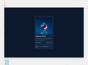
Design comparison
Solution retrospective
Hey everyone, here I am with another solution! :)
I'm pretty happy with the overall results, maybe what I would have done better are transitions. I had an idea of making the central eye blinking when hover over the image, but I didn't find a way to do so.
Also, I'll try to organize better my code to make it easier to read and understand.
What challenges did you encounter, and how did you overcome them?I find difficult to add the overlay effect on the image when hover over it, but I somehow managed to do it by doing some research.
What specific areas of your project would you like help with?I have nothing in particular in mind where it could be improved, aside from what I've mentioned before. Any suggestion, of course, is welcome! :)
Community feedback
- @danielmrz-devPosted 7 months ago
Hello there!
Congrats on completing the challenge! ✅
Your solution looks excelent!
I have just one suggestion:
📌 To improve semantic clarity, opt for
<h1>over<h2>for your main title.It's more than just text size — it's about structuring your content effectively:
<h1>to<h6>are used to define HTML headings, with<h1>being the most significant.- Stick to one
<h1>per page for the main title, and maintain the titles hierarchy with<h1>,<h2><h3>, and so on.
While these adjustments might not alter the visual appearance much, they significantly enhance semantic clarity, SEO optimization, and accessibility.
Hope this suggestion proves helpful! Keep up the great work!
Marked as helpful1@FraCav99Posted 7 months ago@danielmrz-dev Hi thanks for your feedback!
I used an h2 rather than an h1 not for the font's dimensions, but cause I thougth it could be used as a card which can be placed anywhere in the page.
1
Please log in to post a comment
Log in with GitHubJoin our Discord community
Join thousands of Frontend Mentor community members taking the challenges, sharing resources, helping each other, and chatting about all things front-end!
Join our Discord
