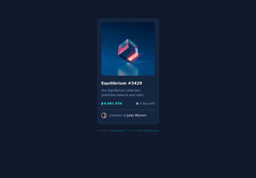
Design comparison
Community feedback
- @VCaramesPosted about 2 years ago
Hey @Girishbanua, some suggestions to improve you code:
- To give you HTML code structure, you want to set up your code in the following manner (only did parent containers):
   <body>
        <main>
          <article class=“card-container”></article>
        </main>
        <footer class="attribution"></footer>
      </body>
The Main Element identifies the main content of the document.
While the Article Element will serve as the card’s container, because the card represents a complete, or self-contained, section of content that is, in principle, independently reusable.
More info:
https://web.dev/learn/html/headings-and-sections/
-
The NFT Alt Tag description needs to be improved upon. You want to describe what the image is; they need to be readable. Assume you’re describing the image/icon to someone.
-
Wrap the "NFT image", "Equilibrium #3429" and "Jules Wyvern" in an Anchor Tags <a>. The anchor tag will allow users to click on content and have them directed to another part of your site.
Happy Coding! 👻🎃
Marked as helpful0
Please log in to post a comment
Log in with GitHubJoin our Discord community
Join thousands of Frontend Mentor community members taking the challenges, sharing resources, helping each other, and chatting about all things front-end!
Join our Discord
