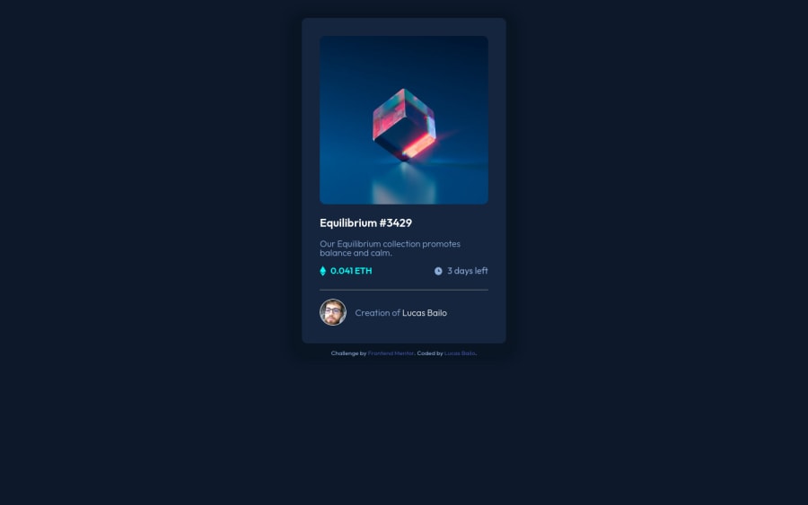
Design comparison
Solution retrospective
This one was good for me to try test my flex box skills. So far, this was the fastest challenge that I was able to complete until the part of doing the image overlay, where I had a lot of problems to find a solution but, luckly I found a video on YT that explains exatcly what you have to do! https://www.youtube.com/watch?v=exb2ab72Xhs
Community feedback
- @AdrianoEscarabotePosted over 2 years ago
Hello Lucas Bailo, how are you? I truly loved your project's outcome, however I have some advice that I hope you'll find useful:
A good practice to center content is using
gridorflex-box, avoid using margin or padding to make placements, use only in the latter case! we can do it like this:Flex-box:
body {
    display: flex;
    align-items: center;
    justify-content: center;
    flex-direction: column;
    min height: 100vh;
}
GRID
body {
    display: grid;
    min height: 100vh;
    place-content: center;
}
To improve the code structure wrap this div:
<div class="attribution">with the semantic tag
footerThe remainder is excellent.
I hope it's useful. 👍
Marked as helpful1@lucasbailoPosted over 2 years ago@AdrianoEscarabote Thanks brother! It was an explanation like this one that I was hopping to find here!! Very helpful =D
0
Please log in to post a comment
Log in with GitHubJoin our Discord community
Join thousands of Frontend Mentor community members taking the challenges, sharing resources, helping each other, and chatting about all things front-end!
Join our Discord
