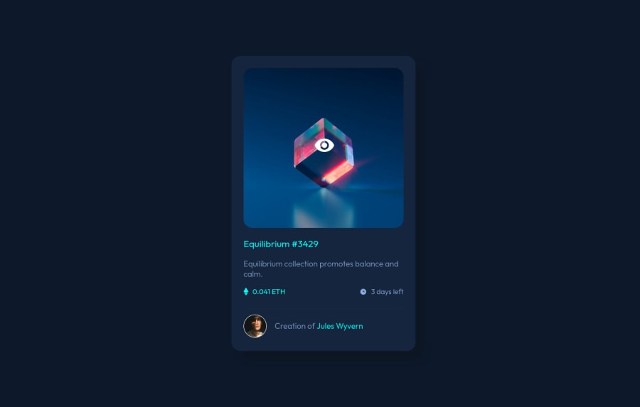
Design comparison
Community feedback
- @VCaramesPosted almost 2 years ago
Hey there! 👋 Here are some suggestions to help improve your code:
- To not only improve your HTML code but to also identify the main content of you page, you will want to wrap your entire component inside the
mainelement.
More Info:📚
- The NFT
alt tagdescription needs to be improved upon. You want to describe what the image is; they need to be readable. Assume you’re describing the image to someone.
More Info:📚
https://www.w3.org/WAI/tutorials/images/
If you have any questions or need further clarification, feel free to reach out to me.
Happy Coding!🎄🎁
Marked as helpful0 - To not only improve your HTML code but to also identify the main content of you page, you will want to wrap your entire component inside the
- @catherineisonlinePosted almost 2 years ago
Nice! 🙌🏻
I would also add some transitions for active states (when colors change on hover). It creates more interactivity and makes the project looks cooler. Active states can be done on buttons, links, titles which act like links or anything else, you choose.
You can read more about it here, in case you haven’t done much of it: https://www.w3schools.com/css/css3_transitions.asp
IF THIS WAS HELPFUL PLEASE MARK IT AS HELPFUL 🤩
Marked as helpful0
Please log in to post a comment
Log in with GitHubJoin our Discord community
Join thousands of Frontend Mentor community members taking the challenges, sharing resources, helping each other, and chatting about all things front-end!
Join our Discord
