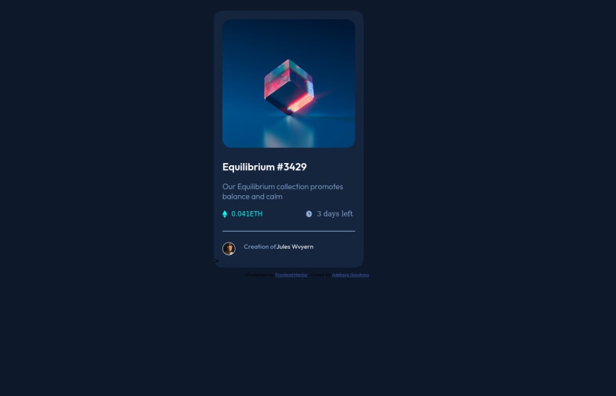


Design comparison

Solution retrospective
As at submission, I found these aspects of the building most difficult
- Finishing the active states of the image
- using {" "} to space out the p from the span element in the last line of the code
- Resposnsiveness
Community feedback
- @vanzasetiaPosted over 1 year ago
Hello, Adebayo Goodness Oluwadamilola! 👋
First, I recommend using a code-formatter. This way, your code base will have a consistent format, which makes it easier to read the code. I suggest using Prettier as your code-formatter.
Prettier · Opinionated Code Formatter
In this case, use interactive elements for any elements that have interactivity. Interactive elements can either be links or buttons.
For your information, anchor tags are for navigation. The
<button>element is for an action such as opening a modal, submitting a form, and toggling an element. It is essential to use the correct elements.Remove the code that I commented. Those are unnecessary styling.
body, html {
  background-color: hsl(217, 54%, 11%);
  /* width: 100%; */
  /* height: 100%; */
  justify-content: center;
  align-items: center;
  /* display: block; */
}
Also, you don't need to select the
<html>element. You should just use the<body>element as the page element of the web.I recommend making the
<main>element as the card instead of using another<section>. Also, the card only needs amax-widthto prevent it from becoming too large. No need forwidthandheight. Let the content controls the height of it.Use a CSS reset whenever you start a new project. This can help you set the styling foundation easily. My recommendation — A Modern CSS Reset | Andy Bell
Never use
pxunit for font sizes. Useremoreminstead. Relative units such asremandemcan adapt when the users change the browser's font size setting. Learn more — Why you should never use px to set font-size in CSSI hope this helps. Have fun coding! 😄
0 - @0xabdulkhaliqPosted over 1 year ago
Hello there 👋. Congratulations on successfully completing the challenge! 🎉
- I have other recommendations regarding your code that I believe will be of great interest to you.
HTML 🏷️:
- Use semantic elements such as
<main>instead of<div class="attribution">to improve accessibility and organization of your page.
- To know more about HTML5 semantic elements such as
<header>,<nav>,<main>,<aside>, and<footer>head out to this article
I hope you find it useful! 😄 Above all, the solution you submitted is great!
Happy coding!
0@bella019Posted over 1 year ago@0xAbdulKhalid I decided to skip the header and footer tags since i did not see a need for it. Should i have included the final aspect in the footer
0@bella019Posted over 1 year ago@0xAbdulKhalid Thank you so much for your comment
0@vanzasetiaPosted over 1 year ago@bella019
You only need to use the
<footer>tag to wrap the attribution. You don't need to use the<header>tag in this case.0


Please log in to post a comment
Log in with GitHubJoin our Discord community
Join thousands of Frontend Mentor community members taking the challenges, sharing resources, helping each other, and chatting about all things front-end!
Join our Discord