Design comparison
Solution retrospective
Hello there,
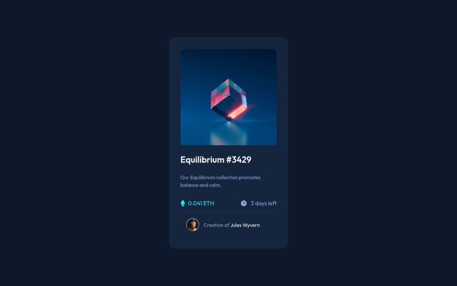
happy to get some feedback on this one. Especially the overlay. I couldn't get to work it 100%. The Icon is not at 100% opacity. Can't get it to work without the background also completly covering the image.
cheers. Flo
Community feedback
- @PhoenixDev22Posted almost 3 years ago
Hello @Flojo994,
I have some suggestions regarding your solution:
-
Using landmark elements , you can improve the navigation experience on your site for users of assistive technology . So wrap the content of the body in
<main>
. -
Anything with a hover style in a design means it's interactive, you need to add an interactive element
<a>
around the image. -
It's invalid html to wrap a heading element in an anchor tag. Swap those around so the anchor is inside the heading
-
The images don't need filled alt. They are decorative images, so
alt
attribute should be left intentionally blank. You can optionally addaria-hidden
orrole presentation
to ensure the images are always ignored by screen readers ANDavatar's one shouldn't be empty and should be more descriptive (not only avatar image). Read about how and when to write image alt text and what it's for. -
The eye image doesn't really need to be in the html, you could do it with css. If you want it to stay in html it needs to be aria-hidden .
-
You can simply use unordered list
<ul>
to wrapclass="card__tracker"
and in each list item<li>
would have<img >
and<p>
. -
No need for a
<footer >
tag in the last part of the component you can use :
<figure class="card__avatar"> <img src="./images/image-avatar.png" alt="avatar image" /* you can use the Jules Wyvern name as alt text */ class="card__profilepicture" /> <figcaption class="card__attribution">Creation of <a href="#">Jules Wyvern</a> </figcaption > </figure>
and use
<footer >
for the FM attribution.Hopefully this feedback helps.
Marked as helpful1@Flojo994Posted almost 3 years ago@PhoenixDev22 Thank you very much for the detailed answer. Already learned something from it. The link regarding atl text will be saved for future use.
1 -
- @Ayon95Posted almost 3 years ago
Hi, good job completing this challenge. You can improve the html markup by using semantic elements like <main>, <article>, <ul>, and <li>. The main content of the page should go inside the <main> element. Instead of <div>, it's better to use <article> for the card component. The <article> element is used to mark up a standalone piece of content that makes sense even when it is taken out of the context of the page.
Also for titles that are also links, you should put the <a> element inside the heading element.
As for the image overlay, you can use a ::before pseudo-element on the image container. Since the overlay has an icon, you can specify that icon in its 'content' property. To center the content, you can use flexbox.
<body> <main> <article class="card"> <div class="card__header> <img class="card__image" /> </div> <h1 class="card__title"><a href="#">Equilibrium #3429</a></h1> <p class="card__description"></p> <ul class="card__stats"> <li class="card__stat"></li> <li class="card__stat"></li> </ul> </article> </main> <footer></footer> </body>
.card__header { position: relative; } .card__header::before { content: url("./images/icon-view.svg"); display: flex; justify-content: center; align-items: center; position: absolute; top: 0; left: 0; width: 100%; height: 100%; background-color: hsla(178, 100%, 50%, 0.4); }
Marked as helpful0@Flojo994Posted almost 3 years ago@Ayon95 Hi, thank you as well for your detailed feedback. Much appreciated. I will try and incorporate your tipps in my next challanges. Haven't used ::bofore or ::after yet. I have to read up on those and try them out.
0@Ayon95Posted almost 3 years ago@Flojo994 Glad you found it helpful. Yeah the ::before and ::after pseudo-elements are useful to know. Kevin Powell on YouTube has some nice videos on them.
0 - @NaveenGumastePosted almost 3 years ago
Hay ! Good Job Florian
These below mentioned tricks will help you remove any Accessibility Issues
-> Add
Main
tag after body like it should be your container. For 1st heading orh1
tag, use header tag and then inside the header put yourh1
orh2
etc . But use header tag only once in main heading element.Keep up the good work!
0
Please log in to post a comment
Log in with GitHubJoin our Discord community
Join thousands of Frontend Mentor community members taking the challenges, sharing resources, helping each other, and chatting about all things front-end!
Join our Discord