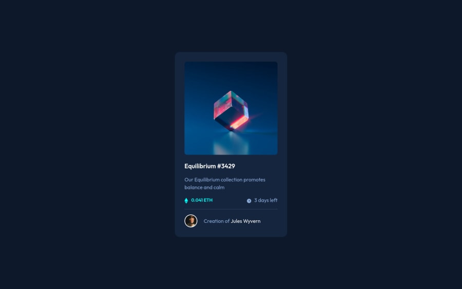
Design comparison
Solution retrospective
My difficutl was how to put the great opacity value in the "icon-view.svg".
Community feedback
- @kartardeveloperPosted about 2 years ago
Hey Marco, you did a great job. Simply add before pseudo selector on your eye image parent element and add opacity and background color there. Add opacity 1 there on hover. Simply add yourElement:hover::before. It won't affect your eye image. I hope you understand and it will help you. Best of luck with your next challenge. 👍
Marked as helpful0 - @correlucasPosted about 2 years ago
👾Hello Marco Pereira, congratulations on completing this challenge!
Nice code and nice solution! You did a good job here putting everything together. I’ve some suggestions for you:
1.The main heading has the tag
<p>, in this case, you should replace it with<h1>since this heading is the main title on this page. Remember that every page should have one<h1>to declare which is the most important title and that you should follow the hierarchy using the heading sequence(h1, h2, h3, h4, h5)and never jump a level.2.Use relative units like
rem or eminstead ofpxto have a better performance when your page content resizes on different screens and devices.REMandEMdoes not just apply to font size, but all sizes as well. To save your time you can code your whole page usingpxand then in the end use a VsCode plugin calledpx to remto do the automatic conversion or use this website https://pixelsconverter.com/px-to-rem3.Use a CSS reset to avoid all the problems you can have with the default CSS setup, removing all margins, and making the images easier to work, see the article below where you can copy and paste this CSS code cheatsheet: https://piccalil.li/blog/a-modern-css-reset/
✌️ I hope this helps you and happy coding!
Marked as helpful0 - @faha1999Posted about 2 years ago
Hello, Marco Pereira Congratulations on finishing this project. It's lovely and great on the whole! Just a little tip:
- You might want to use semantic tags like the
<main>to wrap your code, instead ofdiv. like
<main class="container-fluid main-container d-flex justify-content-center">
</main>
This would help improve accessibility.
-
.card-boxpadding should be1rem -
Instead of using
px, use relative units likerem or emto get better performance when the information on your page needs to be resized for multiple screens and devices.REMandEMapply to all sizes, not justfont-size. You can code your entire page inpxand then, at the very end, use the VsCode pluginpx to remto perform the automatic conversion px to rem
I hope it will work. Happy coding.
Marked as helpful0 - You might want to use semantic tags like the
Please log in to post a comment
Log in with GitHubJoin our Discord community
Join thousands of Frontend Mentor community members taking the challenges, sharing resources, helping each other, and chatting about all things front-end!
Join our Discord
