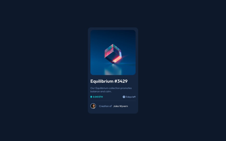
Design comparison
Solution retrospective
Dear members,
It is the second submission for this challenge because the first one had a few bugs which is removed in the solution. The code is improved based on the comment on the previous solution.
Kindly comment on your idea about this submission.
Thanks & regards,
Khalil
Community feedback
- @gwtpraveenPosted over 2 years ago
Congratulation on completing the challenge.
-
In terms of accessibility issues simply wrap all your content between main tags.
-
Instead of an a tag, I recommend wrapping your img tag in a div tag.
    <div class="image-wrapper">
        <img class="ntf-img" src="./images/image-equilibrium.jpg" alt="">
    </div>
Happy Coding!!
0@khalilnazariPosted over 2 years agoHi @Tim5583,
Thanks for your guidance. I intentionally wrapped the <img> take with an anchor tag. It's because when it's clicked on the image page should be directed to profile detail. Otherwise <a> is not suggested.
Cheers!
0 -
- @phichayut-pakPosted over 2 years ago
Congratulations on your fixed submission 🎉🎉 What I would suggest here is :
- Make the eye bigger ( the one that appears when you hover the image )
- change the font and font size of the title
Equilibrium #3429 - Optional Do some transitions to make the website more alive
Happy Coding!
0@khalilnazariPosted over 2 years agoHi @phichayut-pak,
Thanks for the highlight. Sure the font sizing is not accurate because I have not registered for the pro version.
Cheers!
0
Please log in to post a comment
Log in with GitHubJoin our Discord community
Join thousands of Frontend Mentor community members taking the challenges, sharing resources, helping each other, and chatting about all things front-end!
Join our Discord
