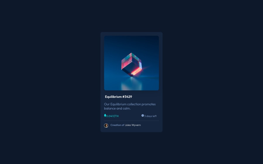
Design comparison
Solution retrospective
I think it's not quite the same as the example of how it should look, but I did my best and I'm still learning HTML and CSS hope that I can make this look alike as the reference suggests if I do learn more.
Community feedback
- Account deleted
It is good, but you are having the same issue I used to have, which is figuring out what the actual size of the elements in the design file are. Here's what you should do:
- If you are using Firefox, open the JPG design file in the Firefox browser.
- Right click anywhere on the site and select "Inspect".
- Select the "Responsive Design Mode" button which is the 3rd button in the top right corner.
- Alter the width size of the page to match the size that the design file is supposed to represent.
- Now you can start creating your site by mirroring the dimensions of the design file in the browser.
Hope that helps. Cheers.
Marked as helpful1 - @lilKriTPosted almost 3 years ago
You did well. Maybe it's not pixel perfect, but that's impossible without getting the actual design files. The website looks good enough :)
One quick advice - you can line up the icon and text on the left using flexbox.
1
Please log in to post a comment
Log in with GitHubJoin our Discord community
Join thousands of Frontend Mentor community members taking the challenges, sharing resources, helping each other, and chatting about all things front-end!
Join our Discord
