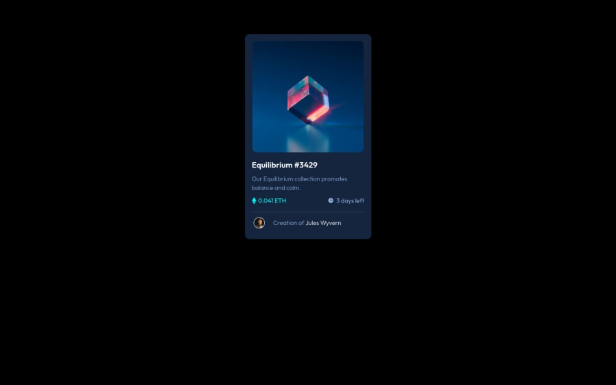
Design comparison
SolutionDesign
Community feedback
- @HassiaiPosted almost 2 years ago
Replace <div class="preview"> with the main tag and <h3> with <h1> to fix the accessibility issues. click here for more on web-accessibility and semantic html
To center .preview on the page, add min-height:100vh; display: flex; align-items: center: justify-content: center; or min-height:100vh; display: grid place-items: center to the body.
To center .preview  on the page using flexbox:
body{
min-height: 100vh;
display: flex;
align-items: center;
justify-content: center;
}
To center .preview on the page using grid: body{ min-height: 100vh; display: grid; place-items: center; }There is no need to give .preview a margin value. Increase the max-width value .preview for it to be equivalent to the width of the design.
max-width:400px/25rem.Hope am helpful.
Well done for completing this challenge. HAPPY CODING
0
Please log in to post a comment
Log in with GitHubJoin our Discord community
Join thousands of Frontend Mentor community members taking the challenges, sharing resources, helping each other, and chatting about all things front-end!
Join our Discord
