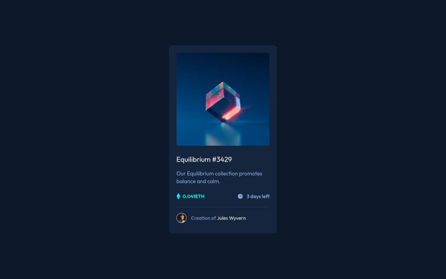
Design comparison
SolutionDesign
Community feedback
- @denieldenPosted about 3 years ago
Hi Hayatunnabi, great work! Congratulations on completing the challenge.
I have some advice for you:
- remove all
marginfrommain-containerclass - use flexbox to the body for center the card. Read here -> flex guide
- after set
heigthofcontainclass to100vhbecause Flexbox aligns to the size of the parent container.
Hope this help ;) and happy coding!
Marked as helpful1@imhayatunnabiPosted about 3 years agoThank you so much ❤️ @denielden for your review on my submission. I am going to look forward on my code and make then correction. And it was very helpful of you. Happy Coding to you too 🔥🔥
1 - remove all
Please log in to post a comment
Log in with GitHubJoin our Discord community
Join thousands of Frontend Mentor community members taking the challenges, sharing resources, helping each other, and chatting about all things front-end!
Join our Discord
