

Design comparison


Solution retrospective
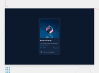
My first challenge after a 4 months stop on coding. I hope this can give people inspiration on doing more challenges.
Feel free to give any feedbacks if you guys want!
Community feedback
- @Abdul400Posted almost 3 years ago
hi, @sqle157.
Generally, everything looks good and scalable. However, I think you have to work on the hover states for instance, use
cursor: pointeron the hover states for the avatar image, and also the name in the NFT component. Also, to allow for accessibility, kindly wrap the primary contents in a main html attribute. On the same note, provide alt descriptions for your images to also allow for accessibility.Otherwise, nice Job for having a clean and readable code!
Marked as helpful0@sqle157Posted almost 3 years ago@Abdul400 Thank you for your feedback! I will take notes on this for my future challenge
1 - @PhoenixDev22Posted almost 3 years ago
Hello Sang Le, Congratulation on completing another project. Your solution is really nice . I have some suggestions ,to tackle the accessibility issues
-
All page content should be contained by landmarks. SoWithin body sits main and footer. The footer element would hold the FM attributionto read more
-
Anywhere there is a hover style on the design it's saying "this is clickable". That means it is essential to use an interactive element for each one(in this case anchor tags) around the image ,
Equilibrium #3429andJules Wyvern. -
whenever you include interactive elements( button, links, input, textarea), make sure you include clearly visible focus-visible styles . This will make the users can navigate this website using keyboard (by using Tab key) easily.
-
Page should contain a level-one heading .
-
For any decorative images, each imgtag should have empty
alt=""andaria-hidden="true"attributes to make all web assistive technologies such as screen reader ignore those images, and avatar ‘salt="”text shouldn’t be empty. -
Always use classes to reference all the elements that you want to style. Using id is going to make your stylesheet have high specificity (hard to maintain).
-
The eye image doesn't really need to be in the html, you could do it with css.
-
You can use unordered list
<ul>to wrapclass="text-flexand in each list item would have<img >and<p>. (no need for divs). -
You shouldn't use
<hr>( no need for a seperator ) you can useborder-topproperty for theclass="author -
You should use
emandremunits .Bothemandremare flexible, scalable units which are translated by the browser into pixel values, depending on the font size settings in your design.
I really hope this feedback helps , happy and keep coding
0@sqle157Posted almost 3 years ago@PhoenixDev22 Thank you for your feedback! It’s a really detailed feedback.
I will take this note into my next project!
0 -
Please log in to post a comment
Log in with GitHubJoin our Discord community
Join thousands of Frontend Mentor community members taking the challenges, sharing resources, helping each other, and chatting about all things front-end!
Join our Discord