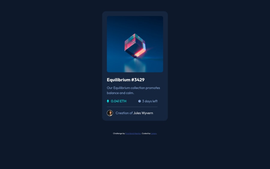
Design comparison
SolutionDesign
Community feedback
- @HassiaiPosted almost 2 years ago
Replace <div class="card">>with the main tag and <div class="attribution"> with the footer tag to fix the accessibility issues. click here for more on web-accessibility
To center .container on the page, add min-height:100vh; display: flex; align-items: center: justify-content: center; or min-height:100vh; display: grid place-items: center to the body.
Use relative units like rem or em as unit for the widths, margins, paddings and font size values. For more on CSS unit click here
Hope am helpful.
Well done for completing this challenge. HAPPY CODING
Marked as helpful0
Please log in to post a comment
Log in with GitHubJoin our Discord community
Join thousands of Frontend Mentor community members taking the challenges, sharing resources, helping each other, and chatting about all things front-end!
Join our Discord
