Design comparison
Solution retrospective
Hello frontend mentors,
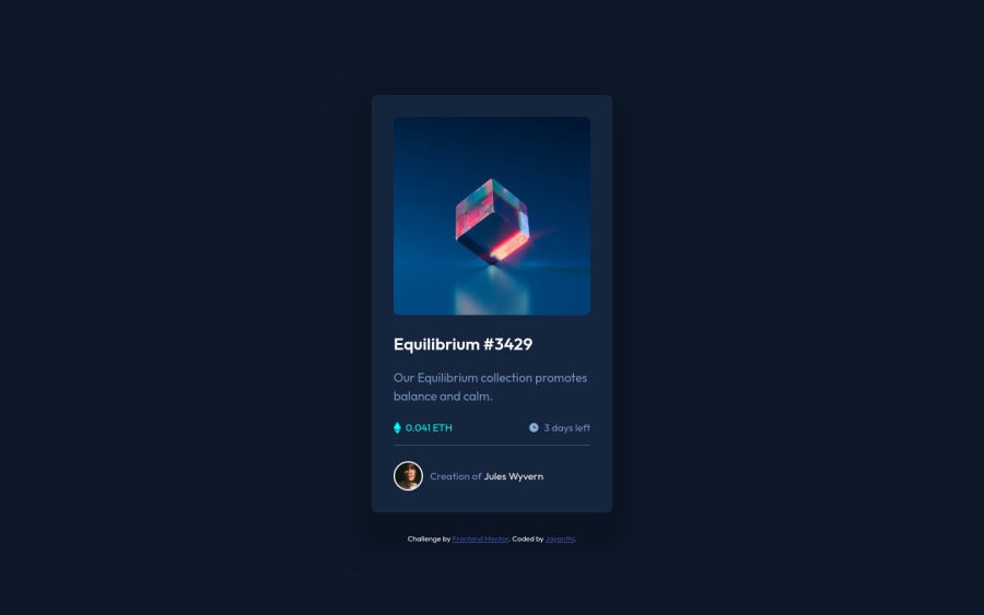
Here's my solution for the nft preview challenge. It was made using HTML,CSS and flexbox. Any feedback and suggestions are welcome.
Community feedback
- @VCaramesPosted almost 2 years ago
Hey there! 👋 Here are some suggestions to help improve your code:
Congrats on completing your first challenge!🎊🎆
- The NFT image
alt tagdescription needs to be improved upon. This is what your users are purchasing. Assume you’re describing the image to someone over the phone.
- The “Icons” serve no other purpose than to be decorative; They add no value. Their
alt tagshould left blank and have anaria-hidden=“true”to hides it from assistive technology.
More Info:📚
https://www.w3.org/WAI/tutorials/images/
- Wrap the "NFT image", "Equilibrium #3429" and "Jules Wyvern" in an
anchor tags. The anchor tag will allow users to click on content and have them directed to another part of your site.
More Info:📚
- Change
widthtomax-widthin your component’s container to make it responsive.
- To properly center your content to your page, you will want to add the following to your
body(this method uses CSS Grid):
body {
    min-height: 100vh;
    display: grid;
    place-content: center;
}
More Info:📚
[Centering in CSS][https://moderncss.dev/complete-guide-to-centering-in-css/]
If you have any questions or need further clarification, feel free to reach out to me.
Happy Coding! 🎄🎁
Marked as helpful0 - The NFT image
- @HassiaiPosted almost 2 years ago<div class="attribution"> should be out of <div class="container">.Replace <div class="container"> with the main tag, <h3> with <h1>and <div class="attribution"> with the footer tag to fix the accessibility issues. for more on semantic html visit https://web.dev/learn/html/semantic-html/
Use the colors that were given in the styleguide.md found in the zip folder you downloaded.
To center .nft on the page, add min-height:100vh; display: flex; align-items: center: justify-content: center; or min-height:100vh; display: grid place-items: center to the body.
Use rem or em as unit for the padding, margin, width and preferably rem for the font-size for more on CSS units watch this https://youtu.be/N5wpD9Ov_To
Hope am helpful.
Well done for completing this challenge. HAPPY CODING
Marked as helpful0
Please log in to post a comment
Log in with GitHubJoin our Discord community
Join thousands of Frontend Mentor community members taking the challenges, sharing resources, helping each other, and chatting about all things front-end!
Join our Discord
