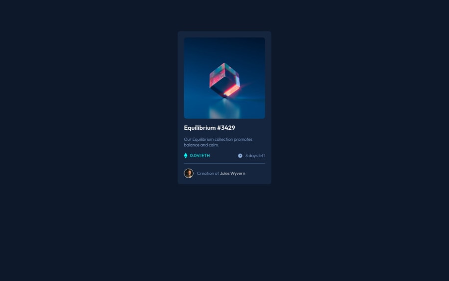
Design comparison
Solution retrospective
I don't think I got the font-sizes correct, compared to the design.
Also, I tried using root values for the colours, but in the end I had to use the hsl values as the values were not recognised.
Would love your feedback!
Community feedback
- @AdrianoEscarabotePosted over 2 years ago
Hello Dhanya, how are you? I truly loved your project's outcome, however I have some advice that I hope you'll find useful:
The main tag must be present in every HTML document so that we can recognize the main content. To fix this, wrap the main content in the main tag. Users of assistive technology will have a better navigation experience on your site thanks to the use of HTML5 landmark elements.
To align some content in the center of the screen, always prefer to use
display: flex;it will make the layout more responsive!Example:
body {
    margin: 0;
    padding: 0;
    display: flex;
    align-items: center;
    flex-direction: column;
    justify-content: center;
    min-height: 100vh;
}
The remainder is excellent.
I hope it's useful. 👍
Marked as helpful1 - @davdifrPosted over 2 years ago
Hey, nice job!
First, I would like to tell you that you used the declarations in :root correctly, but then you didn't use them. Personally, I don't understand why. To use white for example, you just need to use var(--white) where necessary.
In addition, as you can see, the platform suggests using alt in images, for example: <img src="background.png" alt="background">.
These improvements are very simple and I'm sure that with your skills they won't be a problem!
Otherwise, the work is well done!
Marked as helpful1@dhan5aPosted over 2 years ago@davdifr Thank you for your feedback Davide! I didn't use root because of an earlier error I made, there was a trailing curly brace in line 3 of my CSS file. I removed it and it works well. Thank you for reminding me to use alt in my images, I will edit it asap! :)
0 - @elaineleungPosted over 2 years ago
Hi Dhanya, first off, I think you did a great job putting this together! About the custom variables not working, it looks like there's a trailing curly brace in line 3 of your CSS file, and I think if you try to remove that, you'd be able to use the variables (I tried it in the browser just now using your code).
Some suggestions I have here: I'd remove the
width: 50%from the body selector, and if you're hoping to put some space on the sides to prevent the component from touching the browser sides, instead of havingmax-width: 300pxon.card, you can trywidth: min(90%, 300px). This declaration tells the browser to keep the width at 90% until it gets to 300px, at which point the width would be maintained at 300px as the max width.Lastly, about using fixed pixel values in font sizes: It's generally good practice to use relative units (such as rem), so that's something I encourage you to try as well (by default, 1 rem is 16px). One of the main reasons is because relative units allow users to have their own preferred browser/system settings and won't be locked into using fixed sizes in the code.
(Oh, and be sure to fix add alt tags in your
imgelements, otherwise these would show up in your report for sure)Hope this helps you out!
Marked as helpful1@dhan5aPosted over 2 years ago@elaineleung thank you so much!!! this helps me out a ton! :)
0
Please log in to post a comment
Log in with GitHubJoin our Discord community
Join thousands of Frontend Mentor community members taking the challenges, sharing resources, helping each other, and chatting about all things front-end!
Join our Discord
