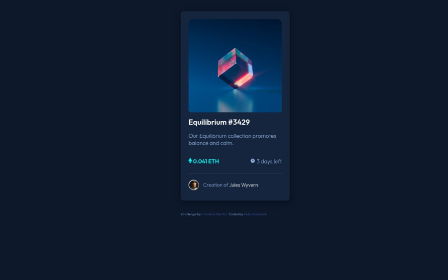
Design comparison
Solution retrospective
How long did it take you to remember you can't hover
on mobile? It took me an hour. TGIF.
Community feedback
- @PhoenixDev22Posted almost 3 years ago
Hello ksmacleod99 , Your solution looks nice. I have few suggestions , To tackle the accessibility issues :
Document should have one main landmark. Wrap the body content in< main>tag read more about main landmark.
-
You need to add an interactive element around the image .
-
Images must have alt attribute .For any decorative images, each img tag should have empty
alt=""
andaria-hidden="true"
attributes to make all web assistive technologies such as screen reader ignore those images. img src="images/icon-clock.svg">,
<img src="images/icon-ethereum.svg">and <img src="images/icon-view.svg">
) . -
The eye image doesn't really need to be in the html, you could do it with css. If you want it to stay in html it needs to be aria-hidden or role presentation with empty alt.
-
You can replace the
<div class="attribution">
by a<footer >
tag and it would be out the< main>
. -
You shouldn't wrap the <img> in <p>(
<p><img src="images/icon-ethereum.svg"> 0.041 ETH</p>
) -
You should use
em
andrem
units .Bothem
andrem
are flexible, scalable units which are translated by the browser into pixel values, depending on the font size settings in your design. you can add this code to center the component on the page .
body{ display: flex; align-items: center; justify-content: center; min-height: 100vh; flex-direction: column;/*because you have two main and footer */ }```. I really hope this feedback helps , happy and keep coding
Marked as helpful0 -
- @FrancisKhaledKhodjaPosted almost 3 years ago
Hello. Excellent job. To improve your page and to center your card use this code (you must learn box position and the transform property)
.card { border-radius: 10px; background-color: hsl(216, 50%, 16%); filter: drop-shadow(0px 5px 10px #070e18); position: relative; top: 50%; left: 50%; transform: translate(-50%, -50%); }
My second advice would be to use rem instead px to define the size of your font or box.
0@ksmacleod99Posted almost 3 years ago@FrancisKhaledKhodja Thank you for this feedback. I will need to read up on the transform property.
0
Please log in to post a comment
Log in with GitHubJoin our Discord community
Join thousands of Frontend Mentor community members taking the challenges, sharing resources, helping each other, and chatting about all things front-end!
Join our Discord