Design comparison
Solution retrospective
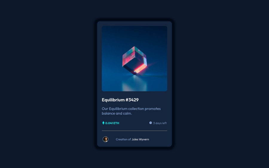
Why does my card take up the entire height of the screen? Note: Adding height or min-height to the card did not help.
Please log in to post a comment
Log in with GitHubCommunity feedback
- @cosmoart
Hi Shikhar!, Congratulations on completing this challenge!, The card does not take up the entire height of the screen: it has the size that its children together with the gap make it have. You can see it clearly from the devtools.
My recommendation would be that you use relative units and change the gap to a
heightalong with ajustify-content: space-betweenAs a last recommendation, personally I don't like the shadow that the card has: it is very "dirty" and striking, I would change it for something more elegant and discreet, something like this:
box-shadow: 0 0 10px 10px hsl(217deg 79% 6% / 15%);I hope this helps you, Happy coding! 👋
Marked as helpful
Join our Discord community
Join thousands of Frontend Mentor community members taking the challenges, sharing resources, helping each other, and chatting about all things front-end!
Join our Discord
