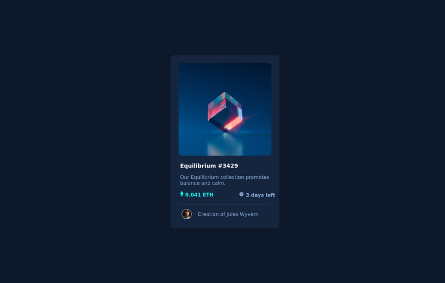
Design comparison
Solution retrospective
-
I also couldn't seem to be able to change the color when the mouse hovers over the NFT card. There's only a certain opacity.
-
I couldn't figure out the layering of the card in order to add a subtle type of depth. I would really appreciate it if someone could help me here.
-
I'm also not too sure if you're being prompted to open a folder before you see the solution, if that's the case, does anyone know how to fix that as well?
Thank you
Community feedback
- @AleromsPosted over 2 years ago
Hey Laura, don't worry on not being about to get the opacity right. This is your first solution posted, congrats! The way I implemented the overlay was by adding another div with a class so I can target it. I set the following:
.overlay { @include b-radius(); position: absolute; width: 100%; height: calc(100% - 4px); top: 0; background-color: hsl(178, 100%, 50%, 50%); z-index: 2; opacity: 0; transition: opacity 0.3s ease-in-out;and when the user hovers over it I changed the opacity to 1. If any of this syntax is unusual to you i'd suggest getting more practice in by starting at the Newbie challenges from easiest to harder.
Cheers!
1
Please log in to post a comment
Log in with GitHubJoin our Discord community
Join thousands of Frontend Mentor community members taking the challenges, sharing resources, helping each other, and chatting about all things front-end!
Join our Discord
