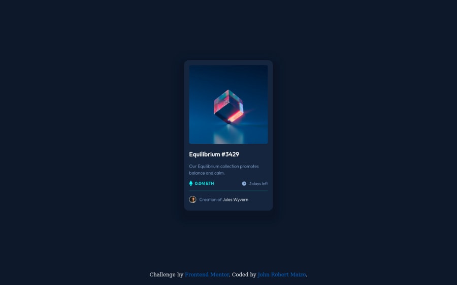
nft-preview-card-component using HTML and CSS
Design comparison
Solution retrospective
What did you find difficult while building the project?: Well, the hard part for me is in the box shadow, I don't know what color so I just experimenting it until somewhat it matches to the design, haha. And also the hard part for me is doing the hover in equilibrium thing.
Which areas of your code are you unsure of?: About spacings of h1 and paragraphs, I don't know what exactly the spacing of it.
Tell me guys if there is something that I'm wrong about. I really appreciate your reviews!
Please log in to post a comment
Log in with GitHubCommunity feedback
- @kurtbuset
watdadamns dodot
Join our Discord community
Join thousands of Frontend Mentor community members taking the challenges, sharing resources, helping each other, and chatting about all things front-end!
Join our Discord
