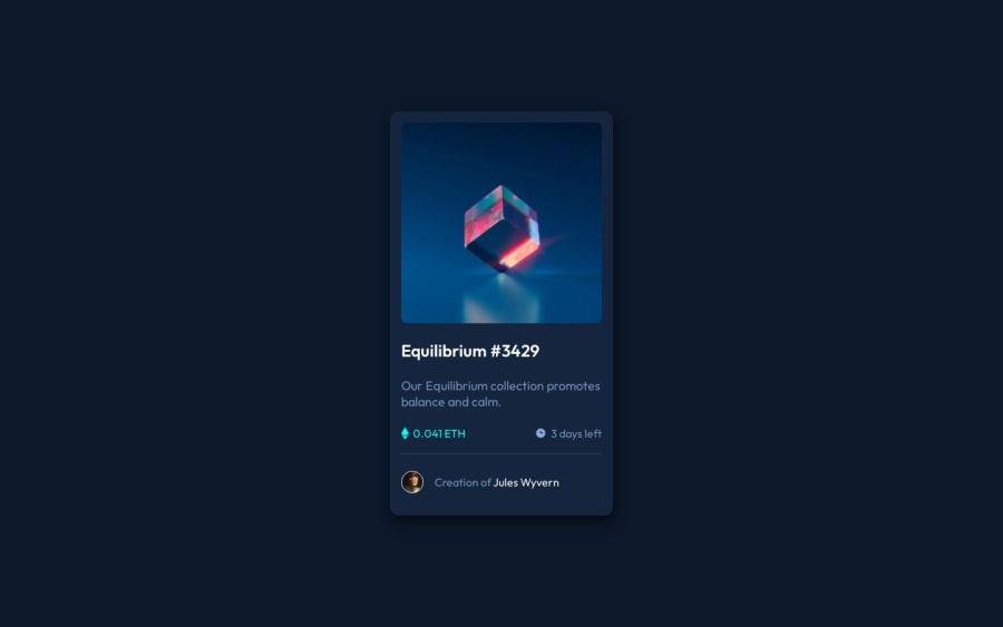
Design comparison
Solution retrospective
Simple solution and basic html plus css
Community feedback
- @danielmrz-devPosted 11 months ago
Hello @smalancea!
Your project looks excelent!
I have just a few minor suggestions for you to improve it:
-
Since the image, the title and the name of the creator are clickable elements, it's a good practice to add
cursor: pointerto them. -
Since the title is the most important title of the page, you can replace your
h2withh1.
The
<h1>to<h6>tags are used to define HTML headings. It's not just about the size, considering that you can style the text with CSS.<h1>defines the most important heading.<h6>defines the least important heading.Only use one
<h1>per page - this should represent the main heading/subject for the whole page. Also, do not skip heading levels - start with<h1>, then use<h2>, and so on.Other than those details, you did a great job!
Marked as helpful0 -
Please log in to post a comment
Log in with GitHubJoin our Discord community
Join thousands of Frontend Mentor community members taking the challenges, sharing resources, helping each other, and chatting about all things front-end!
Join our Discord
