Design comparison
Solution retrospective
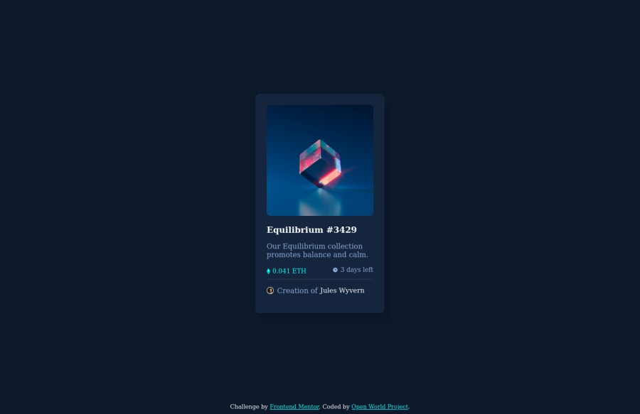
Here is my attempt at the NFT card challenge. I tried to keep it simple but definitely had struggles on the way. Go ahead and look it over and leave some feedback if you got any. I commented the styles and everything is laid out in the CSS by: Root, Semantic styles, then finally Class & ID styles to make it easier to follow. Beginnings and endings of containers are commented inside the HTML file for the same reasoning. Happy Coding!
Please log in to post a comment
Log in with GitHubCommunity feedback
- @Hassiai
Add the language attribute
lang = "en"to the html tag to fix the error issue.Use rem or em as unit for the padding, margin, width and preferably rem for the font-size for more on CSS units Click here
There is no need to give .content a min-height value or a height, give it a padding value for all the sides that will replace the height
Hope am helpful.
Well done for completing this challenge. HAPPY CODING
Join our Discord community
Join thousands of Frontend Mentor community members taking the challenges, sharing resources, helping each other, and chatting about all things front-end!
Join our Discord
