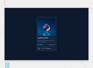
Design comparison
SolutionDesign
Solution retrospective
Any Feedback is Welcome!!
Community feedback
- @andreasremdtPosted about 2 years ago
Hey @ChrysKoum!
You did a great job on the challenge, I like that the design looks so close. The hover transitions are nicely done. I found a couple of things that you could improve:
- Make sure to use some semantic HTML elements, such as
mainorsection. That's also a complaint on your accessibility report. For example,div.cardcould be replaced bymain.cardto indicate that this is the page's main content. - You used an
h5for the only page title, while anh1would be the better choice. Each page should have a main title, and then go lower from there. Since "Equilibrium #3429" is the only title, using anh1would be much better for accessibility and semantics. - The solutions appears to have a couple of interactive elements (like links), but there are no proper HTML tags for that. For example, it's confusing that the title and author have hover effects, but I can't click on them. To fix this, you can use a
aor abuttonfor these elements. - You don't need all these
divelements to center your card. With just a couple lines of CSS, you can make your life much easier:
<body>
  <main class="card">
    Your card content here...
  </main>
</body>
body { display: grid; place-items: center; min-height: 100vh; }Hope that these tips help you improve the solution. Let me know if you have any questions :-)
1 - Make sure to use some semantic HTML elements, such as
Please log in to post a comment
Log in with GitHubJoin our Discord community
Join thousands of Frontend Mentor community members taking the challenges, sharing resources, helping each other, and chatting about all things front-end!
Join our Discord
