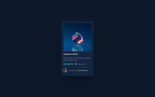
Submitted almost 3 years agoA solution to the NFT preview card component challenge
nft-preview-card-component-main
@bociKond

Solution retrospective
I didn't figure out how to get the time left to stay right, but now typing this I guess I could've used grid instead of flex
Code
Loading...
Please log in to post a comment
Log in with GitHubCommunity feedback
No feedback yet. Be the first to give feedback on bociKond's solution.
Join our Discord community
Join thousands of Frontend Mentor community members taking the challenges, sharing resources, helping each other, and chatting about all things front-end!
Join our Discord