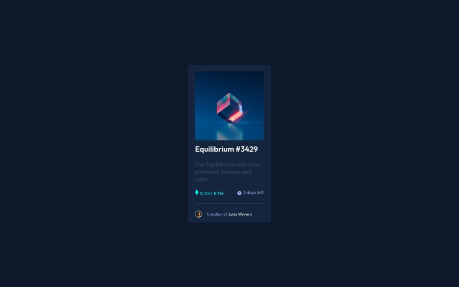
Design comparison
Solution retrospective
Hey guys here is my solution to this challenge. The thing I struggled with the most was adding a hover effect on the image. But after searching a bit on google I figured it out by adding a div that contains the image and after the image, I added another div. that did the trick. With a little bit of CSS, I managed to get it working feel free to check the code. If you found some better ways or solutions please let me know.
Any suggestions or critics are more than welcome :)
Community feedback
- @PhoenixDev22Posted about 2 years ago
Hi Marko Djurdjevic,
Congratulation on finishing this challenge. Excellent work! I have few suggestions regarding your solution:
HTML
- The most important part in this challenge interactive elements. Since there's a :hover state on the image and means it's interactive, So there should be an interactive element around it. When you create a component that could be interacted with a user , always remember to include interactive elements like(button, textarea,input, ..)
for this imagine what would happen when you click on the image, there are two possible ways:
1: If clicking the image would show a popup where the user can see the full NFT, here you use<button>. 2:If clicking the image would navigate the user to another page to see the NFT, here you can use<a>.
- The link wrapping the equilibrium image should either have
Sr-onlytext, anaria-labeloralttext that says where that link takes you.
- For any decorative images, each img tag should have empty
alt=""and addaria-hidden="true"attributes to make all web assistive technologies such as screen reader ignore those images inicon-view, icon-clock, icon-ethereum.
- Profile images like that avatar are valuable content. The alternate text should not be empty. You can use the creator's name
Jules Wyvern. Read more how to write an alt text .
- If you wish to draw a horizontal line, you should do so using appropriate CSS. You may remove the
<hr>, you can useborder-top:to the avatar's part.
- There are so many ways to do the hover effect on the image, The one I would use is pseudo elements
::before, ::after. You can use pseudo-elements to change the teal background color to hsla. Then the opacity can be changed from 0 to 1 on the pseudo element on the hover. Also using pseudo elements makes your HTML more cleaner as there's no need for extra clutter in the HTML. The icon view does not really need to be in the HTML. You can use CSS for it.
- There’s a little gap under the image, you can set
display: block;to the image that’s why you have usedheight: 98%.
- Remember a css reset on every project that make all browsers display elements the same.
- It's all one component , you should remove the
<footer>, it supposed to be for the attribution.
Hopefully this feedback helps.
Marked as helpful0@FrozennnPosted about 2 years ago@PhoenixDev22 Hi,
thank you for your deep clarification and great suggestions I didn't pay much attention to alt texts and better uses of HTML tags for interactive elements but I definitely should!
Also nice catch on the height 98% I was wondering how I could have avoided that.
I really appreciate the feedback, thanks :)
1@PhoenixDev22Posted about 2 years ago@Frozennn
Glad to hear that it was helpful Happy coding!
0 - The most important part in this challenge interactive elements. Since there's a :hover state on the image and means it's interactive, So there should be an interactive element around it. When you create a component that could be interacted with a user , always remember to include interactive elements like(button, textarea,input, ..)
for this imagine what would happen when you click on the image, there are two possible ways:
- @hyrongennikePosted about 2 years ago
HI @Frozennn,
You can use the below rule instead of the one you currently have the main issues with it was the use of a fixed height causing content to overflow out the parent container and also the use of the clamp function when a simple max-width would suffice. Also I would suggest either em, px or rem for margin and padding.
.main-container {
    background-color: var(--Very-dark-blue-card);
    max-width: 350px;
    border-radius: 3%;
    padding: 1.5rem;
}
let me know if you have any more questions.
Marked as helpful0@FrozennnPosted about 2 years ago@hyrongennike Hey, you are right, the height is unnecessary thank you for the suggestions I appreciate it.
1
Please log in to post a comment
Log in with GitHubJoin our Discord community
Join thousands of Frontend Mentor community members taking the challenges, sharing resources, helping each other, and chatting about all things front-end!
Join our Discord
