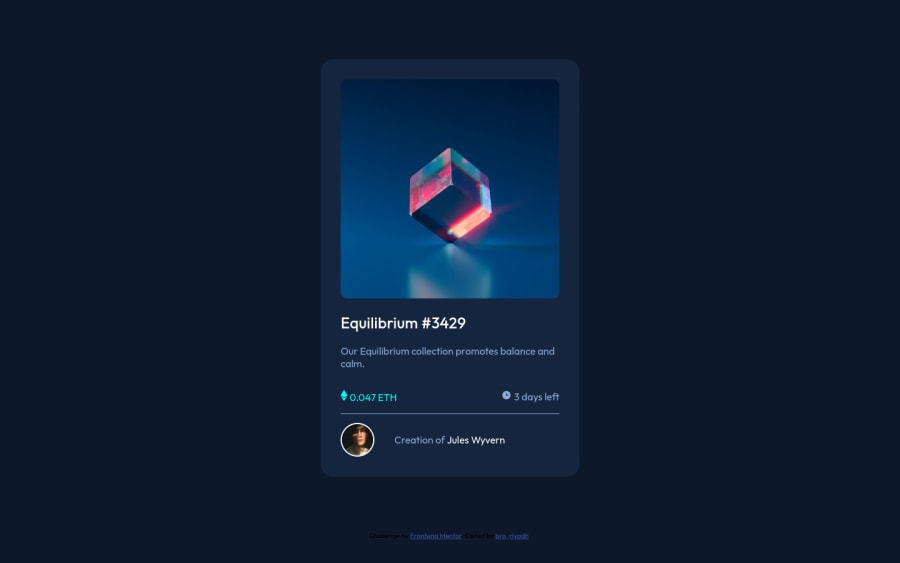
NFT preview card component
Design comparison
Solution retrospective
1)how do I make the component fixed and maintain its width for wider screen
Please log in to post a comment
Log in with GitHubCommunity feedback
- @RioCantre
Hello there! Nice work with this one. Viewing at your solution, I would like to recommend the following for you...
- Remove
width: 75%;in the.containerto have a fix width. - Import the
attributionstyle in the CSS file and removestyletag - Wrap the whole content of
containerwith specific tag likemainandattributionwith `footer tag for readability. For HTML structures, refer it with this one Semantics - Include description for the
altinimgtags - Adjust the opacity of the
.img-container:hover .overlayrule set intoopacity: 0.8;
Above all, you did good in implementing the design. Hope this helps and Keep it going!
- Remove
- @NaveenGumaste
Hay ! Hassan Good Job on challenge
These below mentioned tricks will help you remove any Accessibility Issues
-> Add Main tag after body
<main class="container"></main>-> Learn more on accessibility issues
If this comment helps you then pls mark it as helpful!
Have a good day and keep coding 👍!
- @vinaximus
Nice job. Use the max-width property to not go beyond a particular width
- @PhoenixDev22
Hello @hsn-ng ,
I have some suggestions regarding your solution:
HTML
to tackle the accessibility issues:
-
There should be two landmark components as children of the body element - a
main(which will be the NFT card ) and afooter(which will be the attribution).<Footer>should be in the<main >. -
you can add a
<h1>withclass="sr-only"(Hidden visually, but present for assistive tech).
.sr-only { border: 0 !important; clip: rect(1px, 1px, 1px, 1px) !important; -webkit-clip-path: inset(50%) !important; clip-path: inset(50%) !important; height: 1px !important; margin: -1px !important; overflow: hidden !important; padding: 0 !important; position: absolute !important; width: 1px !important; white-space: nowrap !important; }-
Anything with a hover style in a design means it's interactive. you need to add an interactive element around the image and
Equilibrium #3429andJules Wyvern. -
It would be better
<h2 class="white-txt hover-text"><a href="#">Equilibrium #3429</a></h2> <p class="soft-blue">Creation of <a class="white-txt hover-text">Jules Wyvern</a></p>-
For any decorative images, each img tag should have empty
alt=""andaria-hidden="true"attributes to make all web assistive technologies such as screen reader ignore those images inicon-ethereum.svg" , icon-clock.svg" icon-view.svg" -
the link should be wrapping the original image and either have
Sr-onlytext, anaria-labeloralttext that says where that link takes you. -
The avatar's alt text shouldn't be
alt="user".You can useJules Wyvernas an alt text.
Hopefully this feedback helps.
-
Join our Discord community
Join thousands of Frontend Mentor community members taking the challenges, sharing resources, helping each other, and chatting about all things front-end!
Join our Discord
