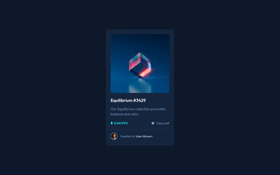
Design comparison
SolutionDesign
Solution retrospective
Hey guys,
Hope you're all doing great. Just submitting another design. I'm very happy with how this one turned out and managed to finish it in a couple hours.
Is it me or is there a shadow effect for the card? I can see it on some images but not on others, I didn't add it anyway.
Also just curious to know what solutions you came up with for the overlay effect on the image.
All the best!
Community feedback
Please log in to post a comment
Log in with GitHubJoin our Discord community
Join thousands of Frontend Mentor community members taking the challenges, sharing resources, helping each other, and chatting about all things front-end!
Join our Discord
