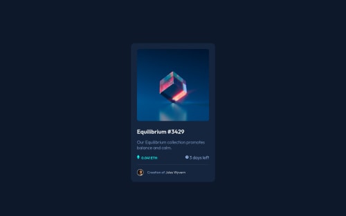
Design comparison
SolutionDesign
Solution retrospective
ETH icon and clock icon goes slight up. Can anyone please help?
Community feedback
- @packerpotPosted almost 2 years ago
Hey there! 👋 Here are some suggestions to help improve your code:
- The image's
alt tag
description needs to be improved. It helps reader to understandimg
description. - You should have to use more semantic HTML tags to better convey the purpose of each element in your code.
- Add hover effect on your (cube
img
), (textdiv
h1
),(id="creator"
),here are some links you get idea how to that img and font. - You can use
div
tag for parallel alignment of your<img>
and<p>
. For example,
Syntax:-
<div class="inner"> <div>img</div> <div>p</div> </div>
- Use this for CSS alignment, adjusting the padding, margin, and gap as you want.
.pt{ display: flex; justify-content: space-between; align-items: center; } .price, .timeleft{ display: flex; flex-direction: row; align-items: center; }
Hope am helpful.
Well done for completing this challenge. HAPPY CODING
0 - The image's
Please log in to post a comment
Log in with GitHubJoin our Discord community
Join thousands of Frontend Mentor community members taking the challenges, sharing resources, helping each other, and chatting about all things front-end!
Join our Discord