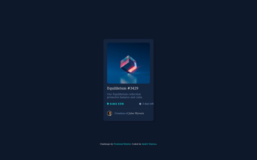
Design comparison
Solution retrospective
I made some improvements. This time i spent a lot of time cleaning up my code and organized every section as much as i could. Please let me know if there is something messy or wrong. Tips concerning techniques, methods or whatever are also welcome :)
Att, André Vinícius.
Community feedback
- @vanzasetiaPosted almost 2 years ago
Hi, André! 👋
Here are some suggestions for improvements.
- Wrap the Equilibrium image with an anchor tag. Then, add a hover effect on the anchor tag. The image should have a hover effect (see the active states design image).
<img>
must havealt
attribute. If it is a decorative image, you should leave the alternative text empty (alt=""
).- Alternative text for images should not contain any words that are related to "image" (e.g. picture, photo, logo, icon, graphic, avatar, etc). It is already an image element (
<img>
) so the screen reader will pronounce it as an image. - The better alternative text for the avatar is "Jules Wyvern" (the name of the person) without "avatar icon of".
- Use flexbox or grid to place the card in the center of the page. These modern techniques are more robust than absolute positioning and have less code to write.
- Remove
height: 420px;
from themain
styling. Usually, it is best to not specify aheight
to an element. Let the content controls the height of it. - Never use
px
unit for font sizes. Userem
orem
instead. Relative units such asrem
andem
can adapt when the users change the browser's font size setting.
I hope my feedback helps. 🙂
Marked as helpful1@zeppelisamaPosted almost 2 years ago@vanzasetia Hello Vanza!
I saw someone saying that if the icon is purely illustrative, i can hide it from the screen readers with alt aria-hidden="true", so that's what i did.
Also, does the height automatically adjusts with the content? I didn't know that, thank you!
0@vanzasetiaPosted almost 2 years ago@zeppelisama
Yes, the height of the card will adjust with the content.
Marked as helpful1 - @fmanimashaunPosted almost 2 years ago
Hi @@zeppelisama,
Nice implementation! However, I feel you might need a better file structure for better file management. e.g saving all your styling in a CSS folder and all images in a img folder or something like that.
On the code, I see you are trying to use the transform property to centre the card on the page, but I think using flexbox will do a better job.
Marked as helpful1@zeppelisamaPosted almost 2 years ago@fmanimashaun Thank you, Michael! Your feedback helps me a lot :D
0
Please log in to post a comment
Log in with GitHubJoin our Discord community
Join thousands of Frontend Mentor community members taking the challenges, sharing resources, helping each other, and chatting about all things front-end!
Join our Discord