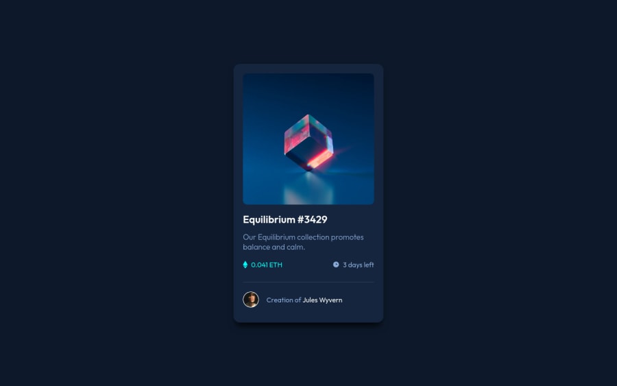
Responsive NFT preview component using HTML & CSS
Design comparison
Community feedback
- @catherineisonlinePosted almost 2 years ago
Nice! 🙌🏻
I would also add some transitions for active states (when colors change on hover). It creates more interactivity and makes the project looks cooler. Active states can be done on buttons, links, titles which act like links or anything else, you choose.
You can read more about it here, in case you haven’t done much of it: https://www.w3schools.com/css/css3_transitions.asp
IF THIS WAS HELPFUL PLEASE MARK IT AS HELPFUL 🤩
Marked as helpful1@jahongirdevPosted almost 2 years ago@catherineisonline Thank's! Of course, I follow the rules in next projects.
0 - @VCaramesPosted almost 2 years ago
Hey there! 👋 Here are some suggestions to help improve your code:
- The NFT
alt tagdescription needs to be improved upon. You want to describe what the image is; they need to be readable. Assume you’re describing the image to someone.
More Info:📚
https://www.w3.org/WAI/tutorials/images/
- The “Icons” serve no other purpose than to be decorative; They add no value. Their
alt tagshould left blank and have anaria-hidden=“true”to hides it from assistive technology.
More Info:📚
https://www.w3.org/WAI/tutorials/images/
- Wrap the "NFT image", "Equilibrium #3429" and "Jules Wyvern" in an
anchor tags. The anchor tag will allow users to click on content and have them directed to another part of your site.
More Info:📚
If you have any questions or need further clarification, feel free to reach out to me.
Happy Coding!🎄🎁
Marked as helpful1@jahongirdevPosted almost 2 years ago@vcarames Thank's! I will work according to the methods you mentioned.
1 - The NFT
- @Ixtiyordev77Posted almost 2 years ago
avvalgilaridan oson vasifa ekan a?
Marked as helpful1
Please log in to post a comment
Log in with GitHubJoin our Discord community
Join thousands of Frontend Mentor community members taking the challenges, sharing resources, helping each other, and chatting about all things front-end!
Join our Discord
