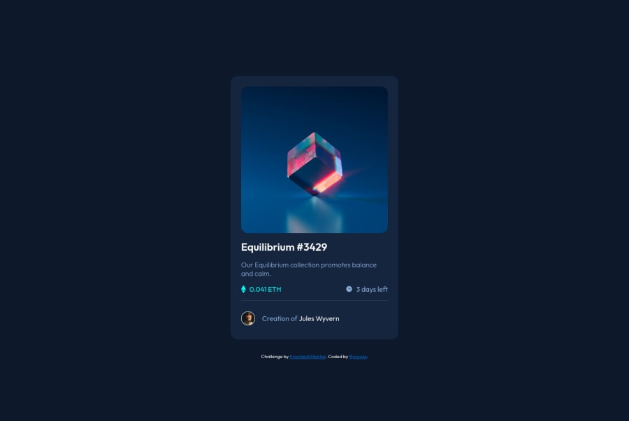
Design comparison
Community feedback
- @Alucard2169Posted almost 3 years ago
Hi there @ryuuwiz Great work on this project, Next thing you can do is to add hover effects that will look really nice i it will also help you understand important design concepts.
Also, you can do something to solve your Accessibility issues.
Really Nice work, Keep It up 😊😊
Marked as helpful2@ryuuwizPosted almost 3 years ago@Alucard2169 Thanks for your feedback. Actually I forgot to add hover effect for the image.
2 - @Anubliss-0Posted almost 3 years ago
Site looks cool!
Like Alucard said, hover effects would really make the page pop. You might know how to use them, but here's some info on Psuedo classes that could be helpful. https://developer.mozilla.org/en-US/docs/Web/CSS/Pseudo-classes#user_action_pseudo-classes
Otherwise it seems that the accessibility issues could be solved with the addition of at least one <main> element.
I got the same issue, but I fixed it by changing the div containing the cards content to the more semantic <main> element.
Great job completing this project!
Marked as helpful1@ryuuwizPosted almost 3 years ago@Anubliss-0 Thanks for your feedback. I will try to fix accessibility issues and many other things I forgot to add.
1
Please log in to post a comment
Log in with GitHubJoin our Discord community
Join thousands of Frontend Mentor community members taking the challenges, sharing resources, helping each other, and chatting about all things front-end!
Join our Discord
