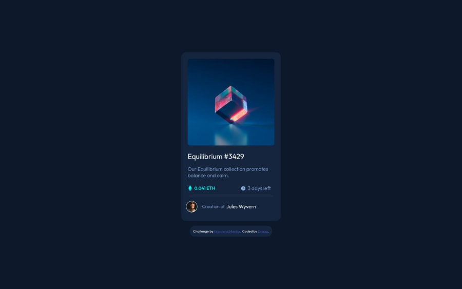
Design comparison
Solution retrospective
This is my third project here and I enjoy it a lot. I had no problems in this project but at the end when i tried to do hover effects I had no problem with text but I couldn't pull of the image hover, because when I tried it i searched a lot about image hovers but I just couldn't implement it into my project here. The view eye was always not opacity 1 when background had to be opacity less than 1 and I couldnt use it only on the image so I had to do another container which I could size properly to the image. I would really like to know how to handle it if someone knows. Any type of critique is appreciated. Thank you :)
Community feedback
- @kartardeveloperPosted about 2 years ago
Hey Drago, You did a great job. I really appreciate your solution to this challenge. The card is good, Responsive is good. Everything looks good.👌
Marked as helpful0
Please log in to post a comment
Log in with GitHubJoin our Discord community
Join thousands of Frontend Mentor community members taking the challenges, sharing resources, helping each other, and chatting about all things front-end!
Join our Discord
