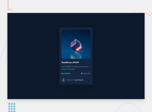
Design comparison
Solution retrospective
I had to compromise on the transparency of the aquamarine rectangle so the view icon would look white. All feedback/recommendations are welcomed!
Community feedback
- @GabrielBC2021Posted over 2 years ago
Hello :D
1.- You can eliminate the default HTML that comes in the projects, so your website looks a little bit better, just a little detail.
2.- You can eliminate the next piece of code, that is not neccesary
.preview-card__image-container:hover .preview-card__image { opacity: 0.3; }3.- When you hover the image, the color coves the background image and in the design is not full cover, so you can just modify that opacity like this:
.preview-card__image-container--overlay:hover { opacity: 0.5; background-color: var(--currency-color); cursor: pointer; }Just some details that will make your website looks better. Good work, keep it up :)
Marked as helpful0@leslief10Posted over 2 years ago@GabrielBC2021 Hi thanks for the feedback! I will keep your first point in mind and delete the code you mentioned on the second point. Regarding your third point, I decided to leave the opacity at 0.9 because the eye icon inside this container would stop being white with a lower opacity. Again, thank you so much for your recommendations!
0
Please log in to post a comment
Log in with GitHubJoin our Discord community
Join thousands of Frontend Mentor community members taking the challenges, sharing resources, helping each other, and chatting about all things front-end!
Join our Discord
